 By
Quick answer: What are the most famous product failures, and why did they fail?
- Wrong question asked — New Coke won blind taste tests of nearly 200,000 people but lost because nobody asked whether people wanted Coke to change.
- No real need — Juicero and Quibi built polished products for problems people didn't have.
- Social and safety cost — Google Glass made wearers and bystanders uneasy; the Galaxy Note 7's batteries caught fire.
- No reason to switch — the Fire Phone and Google+ asked people to leave products that already worked for them.
- Wrong story — the Tata Nano was sold as the 'cheapest car', a label its buyers did not want to own.
Key takeaways
- Most famous failures were technically competent; they failed on desirability, context or trust.
- What people say in a test can differ from what they do in life: New Coke's taste tests missed attachment to the brand.
- A product must beat the user's current way of doing the job by enough to justify switching.
- Positioning is design: how a product is described changes who wants it.
- Cheap, early tests of real behaviour (fake doors, concierge pilots, small launches) would have caught most of these failures.
The teams behind the products in this list were not careless. Coca-Cola ran nearly 200,000 taste tests before changing its formula. Google put working computers into spectacles. Quibi's founders had run Disney's film studio and eBay. They failed anyway, and for remarkably similar reasons. This guide looks at famous product failures from the 1950s to the 2020s, what happened to each, how long it lasted and the specific design or research lesson it leaves for anyone building a product today.

Famous product failures at a glance
| Product | Launched | What went wrong | The lesson |
|---|---|---|---|
| Ford Edsel | 1957 | Over-hyped, unclear market, divisive look | Research the market you'll launch into, not the one you planned for |
| Sony Betamax | 1975 | Lost the format war to VHS's longer recording time | Fit the job users need done |
| New Coke | 1985 | Taste tests missed emotional attachment | Measure behaviour and meaning, not just preference |
| Apple Newton | 1993 | Handwriting recognition didn't match expectations | Don't promise more than the core feature delivers |
| Microsoft Bob | 1995 | Cartoon home metaphor patronised users | Metaphors must help, not decorate |
| Segway | 2001 | No natural place in cities or laws | Design for the real environment |
| Tata Nano | 2009 | 'Cheapest car' label repelled buyers | Positioning is part of the product |
| Google+ | 2011 | No reason to leave existing networks | Beat the current alternative clearly |
| Google Glass | 2013 | Social discomfort, unclear daily use | Design for bystanders too |
| Amazon Fire Phone | 2014 | Gimmicks over everyday value | Features aren't reasons |
| Myntra app-only | 2015 | Removed channels users still relied on | Don't remove a habit by decree |
| Galaxy Note 7 | 2016 | Battery fires and recall | Safety is the first feature |
| Juicero | 2016 | $400 press did what hands could | Solve a problem people have |
| Quibi | 2020 | Paid short video with no clear need | Validate demand before spending |
Table: Famous product failures, their causes and lessons (company statements and contemporary reporting)
- From New Coke's launch to the original's return
- 79 days
- Raised by Quibi before it shut down in 2020
- $1.75 billion
- Google+ sessions under five seconds, per Google
- 90%
- Samsung's estimated cost of the Note 7 problems
- $5.3 billion+
The early classics: Edsel, Betamax, New Coke
Ford Edsel (1957)
Ford launched the Edsel with an enormous publicity campaign in September 1957, after years of planning for a mid-priced market. By the time it arrived, buyers were moving towards smaller, cheaper cars after a recession, and the car's styling, especially the vertical grille, divided opinion. Ford discontinued it in November 1959. The lesson is timing and drift: years of planning can leave a product designed for a market that has changed.

Sony Betamax (1975)
Sony's Betamax was widely regarded as having good picture quality, but its early cassettes recorded only about an hour, while JVC's rival VHS format, from 1976, offered longer recording, enough for a film or a football match. VHS also licensed its format widely, so more machines and more rental tapes appeared. Betamax lost the consumer market, though Sony kept making tapes until 2016. The lesson: match the job people actually want done, here, recording a whole programme.
New Coke (1985)
On 23 April 1985, Coca-Cola replaced its 99-year-old formula with a sweeter one that had beaten the original and Pepsi in taste tests of nearly 200,000 consumers1. What the tests didn't measure was what Coke meant to people. Within weeks, the company was flooded with protest calls and letters, and on 11 July 1985, 79 days later, it announced the return of the original as Coca-Cola Classic2. In behavioural terms it is loss aversion at national scale: taking something away hurts more than an equal improvement pleases.

Interfaces that misread users: Newton and Bob
Apple Newton (1993)
Apple's Newton MessagePad, launched in 1993, was an ambitious handheld computer whose headline feature was recognising handwriting. Early versions often got words wrong, and the mistakes were mocked in comic strips and on television. Later models improved, but the reputation stuck, and Steve Jobs ended the line in 1998. The lesson: when a product's promise rests on one feature, that feature must work reliably from day one; partial success is judged as failure.

Microsoft Bob (1995)
Microsoft Bob replaced the Windows desktop with a cartoon house of rooms, guided by animated characters, for people intimidated by computers. Experienced users found it patronising and slow, and newcomers soon outgrew it; Microsoft withdrew it within about a year. Two things survived it: the Comic Sans font, designed for its speech bubbles, and the idea of an animated assistant, which returned as Office's "Clippy". The lesson: a metaphor must reduce effort, not add a layer of decoration between people and their task (see our post on famous typefaces).
Products that didn't fit the world: Segway and Google Glass
Segway (2001)
Unveiled in December 2001 after intense secrecy and hype, the self-balancing Segway was a genuine engineering achievement. But it fitted neither pavements nor roads, many cities restricted it, and at several thousand dollars it cost far more than a bicycle. It found niches in tours, security and warehouses, and production of the original model ended in July 2020. The lesson: design for the real environment, including rules and infrastructure, not an imagined one.
Google Glass (2013)
Google Glass put a small display and camera into a spectacle frame. The Explorer edition, sold from 2013 for $1,500, worked, but its everyday uses were unclear and its camera made people around the wearer uncomfortable; some bars and cinemas banned it. Google ended the consumer Explorer programme in January 2015 and shifted to business uses, ending the enterprise edition in 2023. The lesson: wearable and social products must be designed for bystanders as well as users.


No reason to switch: Google+ and the Fire Phone
Google+ (2011)
Google+ launched in 2011 with good design ideas, such as "Circles" for sharing with different groups, but people's friends were already on Facebook, and Google pushed sign-ups by tying the service to YouTube and other products. In 2018 Google said that 90% of Google+ user sessions lasted less than five seconds and announced it would shut down the consumer version, which closed in April 20198. The lesson: sign-ups are not usage; measure what people do after they arrive.
Amazon Fire Phone (2014)
Amazon's Fire Phone, launched in July 2014, had "Dynamic Perspective", a 3D effect using four front cameras, and "Firefly" for identifying products to buy. Neither was a reason to leave an iPhone or Android phone, and the price matched premium rivals. Within months Amazon cut the price to 99 cents on contract, and in October 2014 it took a $170 million charge mostly related to unsold phones5. The lesson: novel features are not reasons; people switch for better everyday value.
Positioning and habit: Tata Nano and Myntra
Tata Nano (2009)
The Tata Nano was a real engineering feat: a four-seat car priced around ₹1 lakh at launch, meant for families riding together on a single two-wheeler. It was marketed and remembered as the "world's cheapest car", and its aspirational buyers did not want to be seen in one; early fire incidents and a delayed factory move also hurt. Ratan Tata later said that branding it the cheapest car was a mistake7. The lesson: positioning is part of the product; the same car described differently would have appealed to different people.

Myntra's app-only switch (2015)
In 2015 the fashion retailer Myntra shut its mobile and desktop websites to become app-only, betting that shopping would move entirely to apps. Many customers still searched, browsed and shared on the web; Myntra brought back a mobile site in early 2016 and its desktop site by mid-20169. The lesson: don't remove a channel people rely on to force a habit; move them by making the new channel better.
Safety and need: Galaxy Note 7, Juicero, Quibi
Samsung Galaxy Note 7 (2016)
The Note 7 went on sale in August 2016 and was soon linked to battery fires. Samsung recalled it, but some replacement phones also overheated, and the company discontinued it in October 2016. In January 2017 Samsung's investigation, involving 700 researchers testing more than 200,000 devices and 30,000 batteries, blamed design and manufacturing problems in batteries from two suppliers, and the company estimated the problems would cost at least $5.3 billion6. The lesson: safety is the first feature, and rushed validation can wipe out every other one.
Juicero (2016)
Juicero sold a Wi-Fi-connected juice press, originally priced around $700 and later $400, that squeezed proprietary packs of chopped fruit. It raised about $120 million from investors. In April 2017 Bloomberg reporters showed the packs could be squeezed by hand almost as effectively as by the machine4, and the company shut down later that year. The lesson: a product must solve a real problem; elegant engineering on a non-problem is still a non-product.
Quibi (2020)
Quibi launched on 6 April 2020 with $1.75 billion raised and short, high-budget shows designed for phones. It launched as lockdowns kept people at home rather than commuting, competed with free short video on YouTube and TikTok, and at first didn't let people share clips or watch on a television. It announced in October 2020 that it would wind down3, and closed on 1 December 2020. The lesson: money can't substitute for evidence that people want the product in the form offered.
Why products fail: the patterns behind the stories
The cases above fall into a few recurring patterns, and each pattern has a cheaper test that would have revealed it.

Asked the wrong question
New Coke measured taste, not attachment; Google+ counted sign-ups, not sessions. Test the behaviour that matters.
No real need
Juicero and Quibi built well for problems people didn't feel. Start from a problem users already spend time or money on.
No reason to switch
The Fire Phone and Google+ asked people to abandon something that worked. The new product must be clearly better at the job.
Wrong context
Segway and Glass didn't fit streets, laws or social norms. Test in the real environment, with the people around the user.
There is a psychological trap behind many of these: the teams loved their products. Behavioural researchers call it the IKEA effect, the tendency to value what we build ourselves more than others do. It is why outside evidence, not internal enthusiasm, should decide launches.
How to test before you fail

- Watch current behaviour — interview potential users about how they solve the problem today, and what it costs them.
- Test demand cheaply — a landing page, a waitlist, a pre-order or a manual "concierge" version before building the full product.
- Measure use, not opinions — track whether people come back in week two, not whether they say they like it.
- Test in context — put prototypes into the real setting: the street, the shop, the family, the office.
- Check positioning with buyers — test how the product is described as carefully as how it works.
- Launch small — one city, one segment, one feature, so failure is cheap and learning is fast.
Our guide to building an MVP covers these tests in detail, and the Kano model helps sort features people expect from those that would actually delight them. If you have a product in market and want to know why people aren't sticking, a retention and churn audit finds where they drop off.
How we researched this
Each case is based on company statements (Coca-Cola, Google, Samsung, Amazon's earnings disclosures) and contemporary reporting, cited above. Dates in the lifespan chart are approximate launch and discontinuation dates from those records. The lessons are our analysis as product and UX practitioners. Photographs are from Wikimedia Commons and the Smithsonian's National Museum of American History, credited under each. Last reviewed October 2026.
Frequently asked questions
What is the biggest product failure of all time?
There is no single agreed answer, but frequently cited examples include the Ford Edsel (1957), New Coke (1985), Sony's Betamax, Google Glass, the Samsung Galaxy Note 7, Quibi and Juicero. By money lost, Quibi's $1.75 billion raised and the Note 7's estimated cost of at least $5.3 billion are among the largest.
Why did New Coke fail?
Coca-Cola changed its formula in April 1985 after blind taste tests with nearly 200,000 consumers preferred the sweeter new version. The tests did not measure people's emotional attachment to the original. After protests, letters and calls, the company brought back the original as Coca-Cola Classic 79 days later, on 11 July 1985.
Why did Google Glass fail?
Google Glass worked technically, but it was expensive at $1,500 for the Explorer edition, had limited everyday uses and made people around the wearer uneasy because of its camera; some venues banned it. Google ended the consumer Explorer programme in January 2015 and later focused on business uses, ending the enterprise edition in 2023.
Why did Quibi fail?
Quibi launched in April 2020 with $1.75 billion in funding and short premium shows for phones, but it gave people little reason to pay when free short video was everywhere, launched as pandemic lockdowns kept people at home, and initially didn't let users share clips or watch on TVs. It announced its shutdown in October 2020.
Why did the Tata Nano fail?
The Nano, launched in 2009, was marketed as the world's cheapest car. Its target buyers, families moving up from two-wheelers, did not want a car labelled 'cheap', and early fire incidents and production delays hurt trust. Ratan Tata later said branding it the cheapest car was a mistake.
How can startups avoid product failure?
Test whether people want the product before building it fully: interview users about their current behaviour, run small paid pilots or landing-page tests, watch real usage rather than asking opinions, and measure retention, not just sign-ups. Most famous failures would have shown warning signs in such tests.
Sources
- The Coca-Cola Company — New Coke: the most memorable marketing blunder ever?
- History.com — Why Coca-Cola's 'New Coke' flopped
- Axios — Quibi says it's shutting down (October 2020)
- Snopes / Bloomberg reporting — Can you squeeze a Juicero pack by hand? (2017)
- VentureBeat — Amazon writes off $170M on weak Fire Phone sales (2014)
- ABC / AP — Samsung: Note 7 battery design, manufacturing caused fires (January 2017)
- Business Today — Ratan Tata says branding Nano as cheap car was wrong (2015)
- Google — Project Strobe: protecting your data, improving our third-party APIs, and sunsetting consumer Google+ (2018)
- The News Minute — Myntra's app-only move backfires; relaunches desktop site (2016)
- Checked October 25, 2026. Figures that change — fees, salaries, prices — are reviewed every six months; if something is out of date, tell us.
Where to go from here
- Kano model — which features delight and which just add cost
- What is an MVP? — how to test before you build
- IdeasWhy startups fail: 20 failed startups and the one mistake behind eachWhy startups fail, told through 20 real collapses — Quibi, Juicero, Webvan, Vine, Dunzo, PepperTap, Stayzilla and more — with the lesson from each.
- Design historyOld website designs: what Google, Amazon, Yahoo, YouTube and Facebook looked like at launchSee old website designs from the first web page (1991) to Google, Amazon, YouTube and Flipkart at launch, with Wayback Machine links and what each one teaches.
- Design historyLogo evolution: how 20 famous logos changed, and why almost all of them got simplerLogo evolution of 20 brands from Coca-Cola (1886) to Air India (2023): who designed each, what changed, and the memory science behind simpler logos.
- App developmentWhat is an MVP? Examples, cost and how to build oneAn MVP is the smallest version of a product that tests whether people want it. Definition, famous examples, types, cost in India and how to build one.
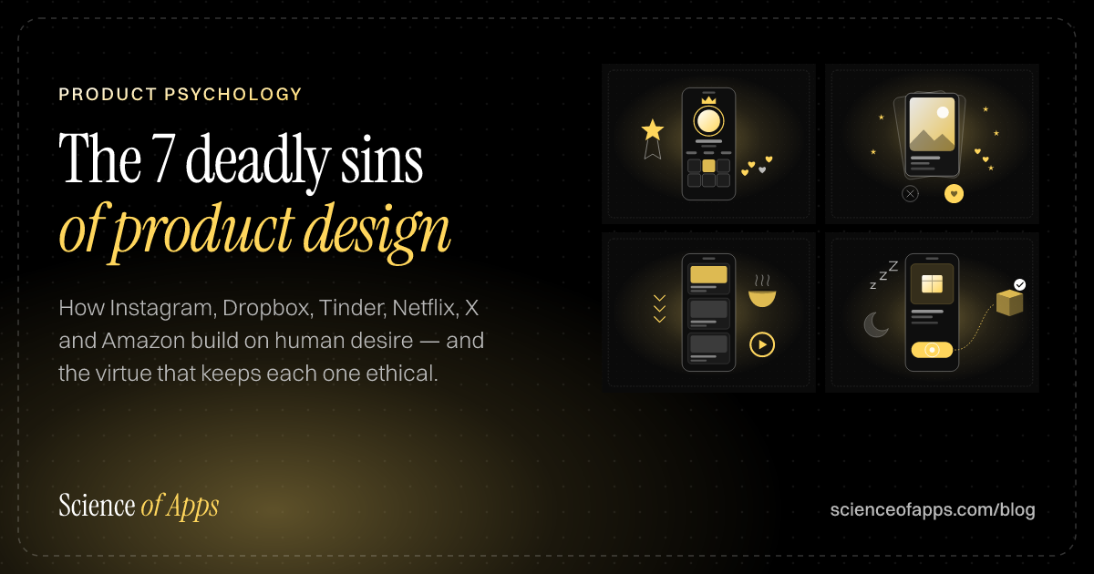
- UI/UX designThe 7 deadly sins of product design: how great products are built on human desireHow Instagram, Dropbox, Tinder, Netflix, X and Amazon build on pride, greed, lust, envy, gluttony, wrath and sloth — and the virtue that keeps each one ethical.
- Tech explainedApp permissions explained: what each one lets an app see, and which to allowApp permissions explained for Android and iPhone: what camera, location, contacts, SMS and accessibility access allow, which to refuse and how to check them.

Get the ideas, not the noise.
Sign up with Google and we’ll send you short UX psychology tips by email — why people tap, stall and leave, and what to do about it. Unsubscribe anytime. Prefer something to keep? Get the free Laws of UX guide as a PDF.
Adoption is where products win or fail.
A behavioral UX audit of your app or SaaS product: why users hesitate, stall and leave, and a prioritized fix list. Fixed price, 2–4 weeks.