
 By
Quick answer: the seven deadly sins of product design
- Pride — profiles, badges, streaks and shareable recaps. Built on it: Instagram, Spotify Wrapped. Its virtue: humility.
- Greed — rewards, referrals, cashback and free tiers. Built on it: Dropbox, LinkedIn. Its virtue: charity.
- Lust — swipes, beautiful imagery and anticipation. Built on it: Tinder, Hinge. Its virtue: chastity.
- Envy — invites, waitlists, leaderboards and “who viewed you”. Built on it: Gmail, Duolingo. Its virtue: gratitude.
- Gluttony — infinite feeds, autoplay and instant delivery. Built on it: TikTok, Netflix. Its virtue: temperance.
- Wrath — replies, reviews, ratings and rants. Built on it: X (Twitter), Yelp & Glassdoor. Its virtue: patience.
- Sloth — one tap, smart defaults and automation. Built on it: Amazon, Uber. Its virtue: diligence.
Key takeaways
- Every product people cannot put down feeds at least one of seven ancient desires. Name yours, and design for it on purpose.
- The desire gets people in the door; the matching virtue keeps them. Pride needs humility, greed needs charity, sloth needs diligence.
- The biggest products stack two to four sins. Instagram runs on pride, envy, lust and gluttony at once.
- A sin becomes a dark pattern when it works against the user. Regulators now fine that — Amazon's $2.5 billion FTC settlement in 2025 is the clearest warning.
- Pair every engagement metric with an outcome metric, so you can tell desire from damage.
Where the seven sins come from
The list is about 1,600 years old. In the 4th century the Christian ascetic Evagrius Ponticus described eight “evil thoughts” that could break a monk's resolve. Pope Gregory the Great, who reigned from 590 to 604, set out seven capital sins, and Thomas Aquinas elaborated them in the 13th century. In the order Encyclopaedia Britannica gives, they are pride, greed, lust, envy, gluttony, wrath and sloth.
They were called “capital” — from the Latin caput, head — because each was thought to be the source of many other wrongs. Dante built a mountain out of them, Chaucer closed The Canterbury Tales with them, and Hieronymus Bosch painted them on a tabletop. Each sin was also paired with a virtue that counters it.
What medieval theologians saw as dangers, product teams now see as motivation. They are the same forces: the wish to be admired, to have more, to want, to compare, to consume, to lash out and to rest. Silicon Valley noticed long ago.
“Social networks do best when they tap into one of the seven deadly sins.”
— Reid Hoffman, co-founder of LinkedIn, in The Wall Street Journal (2011). He went on to call Facebook ego, Zynga sloth and LinkedIn greed.
The sin–virtue rule
Building on a sin is not the same as exploiting it. The products that last for decades do two things at once: they speak to a raw desire, and they protect the user from its worst version. We call it the sin–virtue rule: sell the sin, ship the virtue.
- 01
Name the desire
Which of the seven does your core action feed? Write it down — teams that cannot name it usually design for none.
- 02
Design the hook
Turn the desire into one repeatable action: post, invite, swipe, scroll, reply, tap.
- 03
Ship the virtue
Add the guardrail that keeps the desire healthy: limits, honesty, control, an easy exit.
- 04
Measure both
Track the engagement the sin creates and the outcome the virtue protects. If one rises while the other falls, stop.
The seven sins at a glance
| Sin | The desire | Product hook | Built on it | Virtue |
|---|---|---|---|---|
| I. Pride | To be seen, admired and proud of who you are | Profiles, badges, streaks and shareable recaps | Instagram, Spotify Wrapped, Strava, GitHub | Humility |
| II. Greed | To get more, for less | Rewards, referrals, cashback and free tiers | Dropbox, LinkedIn, CRED, Starbucks Rewards | Charity |
| III. Lust | To want something, on sight | Swipes, beautiful imagery and anticipation | Tinder, Hinge, Airbnb, Pinterest | Chastity |
| IV. Envy | To have what others have | Invites, waitlists, leaderboards and “who viewed you” | Gmail, Duolingo, LinkedIn, Clubhouse | Gratitude |
| V. Gluttony | More, now, without stopping | Infinite feeds, autoplay and instant delivery | TikTok, Netflix, YouTube, Swiggy & Zomato | Temperance |
| VI. Wrath | To be heard — and to get even | Replies, reviews, ratings and rants | X (Twitter), Yelp & Glassdoor, Reddit, Angry Birds | Patience |
| VII. Sloth | To get it done without effort | One tap, smart defaults and automation | Amazon, Uber, UPI, Blinkit & Zepto | Diligence |
Pride: profiles, badges, streaks and shareable recaps
The desireTo be seen, admired and proud of who you are
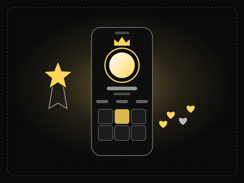
Products built on pride give people a stage and a mirror: a profile to polish, progress to show off and a recap worth sharing. Instagram, Spotify Wrapped, Strava and GitHub all turn what users do into something they are proud to display — and every share is free distribution.
Britannica defines pride as an excessive love of one's own excellence — thinking more of yourself than you ought to.
Why it works
People do not just use products; they perform an identity through them. A profile, a streak or a year-end recap is something the user made, so they value it more (the IKEA effect) and are reluctant to walk away from it (the endowment effect). A well-designed recap also creates a peak moment people remember the whole product by.
Principles at work: IKEA effect, Endowment effect, Peak-end rule
Companies built on pride
Instagram
The profile grid is a personal gallery and the follower count a public scoreboard. Posting is an act of self-presentation.
Spotify Wrapped
A yearly recap of your listening, formatted as Stories so millions of people post their taste — and Spotify's logo — every December.
Strava
Kudos, personal records and segment leaderboards turn a solo run into an achievement with an audience.
GitHub
The contribution graph turns a developer's work into a visible green grid that people screenshot, share and protect.
How to build for pride
- Give users an artifact to show: a profile, a portfolio, a recap or a certificate that is theirs, not yours.
- Celebrate the user's progress, not your feature. “You saved 14 hours this month” beats “Try our new dashboard”.
- Make sharing a one-tap, good-looking default — design the share card as carefully as the screen.
- Let identity accumulate. The longer someone's history, the more the product feels like part of who they are.
Where it turns deadly
Pride turns harmful when vanity metrics become a public ranking of a person's worth. Constant comparison of likes and followers is linked to anxiety, which is why Instagram began letting people hide like counts in 2021.
The virtue: Humility
Keep progress private by default, celebrate effort over popularity, and let people hide the numbers that make them feel small.
Metric to watchShare rate of user-made artifacts, and the share of active users with a completed profile.
Greed: rewards, referrals, cashback and free tiers
The desireTo get more, for less
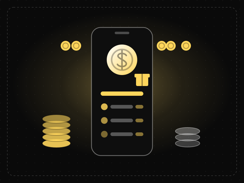
Products built on greed make value countable: free storage, cashback, points and two-sided referral bonuses. Dropbox grew from about 100,000 to over 4 million sign-ups in 15 months with a referral that paid both sides in storage. The healthy version rewards behavior that is good for the user too.
Britannica defines greed as the immoderate love or desire for riches and possessions — or for fame, attention and power.
Why it works
We feel losses about twice as strongly as gains, so a reward we have half-earned is hard to abandon. Progress bars toward a reward speed up as the goal gets closer (the goal-gradient effect), and a gift given first makes people want to give back (reciprocity). Unpredictable rewards are the most compelling of all.
Principles at work: Loss aversion, Goal-gradient effect, Reciprocity, Variable reward
Companies built on greed
Dropbox
Invite a friend and you both get extra free storage. Sign-ups grew roughly 40-fold in 15 months, according to founder Drew Houston.
LinkedIn
Reid Hoffman, its co-founder, summed it up himself: LinkedIn is greed — the promise of the next job, deal or raise.
CRED
In India, CRED rewards members for paying their credit-card bills on time — greed pointed at a good habit.
Starbucks Rewards
Stars fill a visible bar toward a free drink, so the next purchase always feels like progress.
How to build for greed
- Make the reward concrete and countable: gigabytes, rupees, minutes saved, not vague “perks”.
- Reward both sides of a referral, so inviting a friend feels generous rather than salesy.
- Show progress toward the next reward, and start the bar slightly filled.
- Tie rewards to the behavior that creates long-term value — completing a profile, paying on time, inviting a teammate.
Where it turns deadly
Greed turns harmful when rewards push people toward risk. Robinhood removed its celebratory confetti animation in March 2021 after regulators and politicians criticized it for “gamifying” investing.
The virtue: Charity
Give real value first — a generous free tier, savings shared with the user — and never reward behavior that costs them money they did not mean to spend.
Metric to watchViral coefficient (invites sent × acceptance rate), and the lifetime value of rewarded users against everyone else.
Lust: swipes, beautiful imagery and anticipation
The desireTo want something, on sight
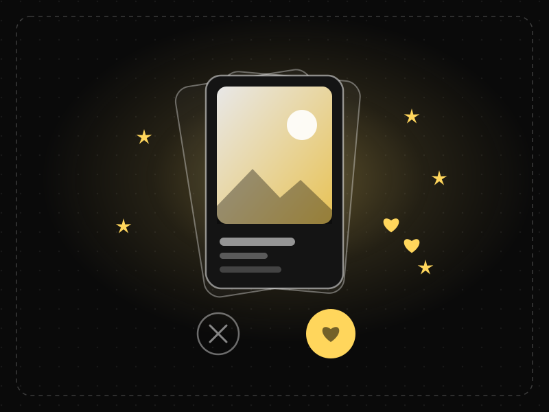
Products built on lust make desire instant and visual. Tinder turned attraction into a one-thumb swipe, Airbnb's founders photographed listings themselves because better photos sold more stays, and Apple makes hardware desirable before you touch it. The best of them deliver what the image promised.
Britannica defines lust as inordinate desire. In product terms, it is raw attraction — the pull of something beautiful or someone new.
Why it works
Wanting and liking are different systems in the brain: anticipation can pull harder than the reward itself. People also judge attractive interfaces as easier to use (the aesthetic-usability effect), and a reveal that is held back — the next card, the next photo — keeps attention through curiosity.
Principles at work: Aesthetic-usability effect, Curiosity gap, Variable reward
Companies built on lust
Tinder
The swipe made attraction a single gesture with an unpredictable reward: a match.
Hinge
Its slogan, “designed to be deleted”, sells the outcome — a relationship — instead of the endless hunt.
Airbnb
In its early days the founders photographed New York listings themselves; professional photos became a core part of the product.
Pinterest
Boards of things people want, organized as a visual wish list that leads straight to a purchase.
How to build for lust
- Make the object of desire the hero of the screen — image first, specs second.
- Invest in imagery the way you invest in code: photo guidelines, templates and quality checks.
- Use anticipation honestly: a reveal, a countdown, a “new for you” moment.
- Sell the outcome the user wants (a date, a stay, a look), not time spent in your app.
Where it turns deadly
Lust turns harmful when the product sells the chase and never the catch — endless swiping that feels like progress but rarely leads anywhere — or when imagery misrepresents what the user will actually get.
The virtue: Chastity
In product terms, fidelity: deliver exactly what the image promised and measure success by outcomes, the way Hinge counts dates, not swipes.
Metric to watchIntent-to-outcome rate: save to purchase, match to conversation, listing view to booking.
Envy: invites, waitlists, leaderboards and “who viewed you”
The desireTo have what others have
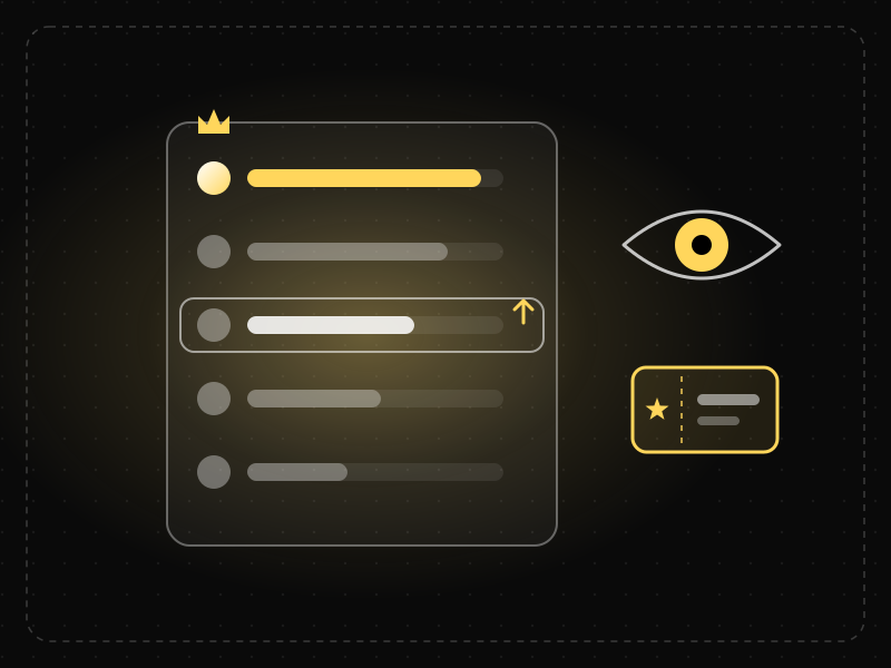
Products built on envy make other people's progress visible and access feel scarce. Gmail launched in 2004 as invite-only, so an invitation became a status symbol; Duolingo's weekly leagues show learners overtaking you; LinkedIn tells you who viewed your profile. Healthy envy motivates. Fake scarcity manipulates.
Britannica defines envy as resentment at another's good fortune, with an often insatiable desire to have it for yourself.
Why it works
We judge ourselves by comparison with people like us, and we follow what others are doing (social proof). Anything scarce — an invite, a seat, a badge few people hold — looks more valuable, and missing out on it registers as a loss.
Principles at work: Social proof, Scarcity effect, Loss aversion
Companies built on envy
Gmail
Launched on 1 April 2004 by invitation only, with far more storage than rivals. Invites were traded online.
Duolingo
Weekly leagues rank you against other learners, so a few minutes of practice feels like a competition you can win.
LinkedIn
“Who viewed your profile” shows curiosity and status — and the full list is a reason to upgrade.
Clubhouse
Its invite-only launch in 2020–21 made access itself the thing people wanted.
How to build for envy
- Show progress relative to peers, but let people pick a fair comparison group.
- Use scarcity only when it is real: limited seats, genuine capacity, a true launch window.
- Turn invites into gifts the user is proud to give, not spam they are bribed to send.
- Show what people like the user have achieved, so the next step feels within reach.
Where it turns deadly
Envy turns harmful when scarcity is invented. In 2019 the UK Competition and Markets Authority secured commitments from Booking.com, Expedia and four other hotel sites to stop pressure selling, such as giving a false impression of a room's popularity.
The virtue: Gratitude
Compare people with their past selves (“you beat last week's you”), celebrate others' wins, and never fake demand.
Metric to watchInvite acceptance rate, and retention of users in competitive features against those outside them.
Gluttony: infinite feeds, autoplay and instant delivery
The desireMore, now, without stopping
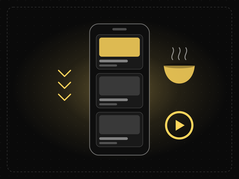
Products built on gluttony remove the reasons to stop. TikTok's full-screen feed never ends, Netflix starts the next episode before you decide, and Swiggy, Zomato and DoorDash put food at your door in minutes. They win on consumption — and they last when they also add healthy stopping points.
Britannica defines gluttony as excess in eating and drinking — consuming beyond reason.
Why it works
Every stopping cue — the end of a page, the end of an episode — is a moment to leave. Remove it and the default becomes “keep going”. Unpredictable rewards in a feed keep people swiping, and an unfinished story (the Zeigarnik effect) pulls them into the next one.
Principles at work: Variable reward, Default effect, Zeigarnik effect
Companies built on gluttony
TikTok
A full-screen, personalized feed with no end and no decision between videos.
Netflix
Autoplay counts down to the next episode, so continuing takes no effort and stopping takes one.
YouTube
Autoplay and recommendations line up the next video while you are still watching this one.
Swiggy & Zomato
Food, groceries and snacks in minutes, with reorders one tap away.
How to build for gluttony
- Shorten the time to the next good thing: personalize, prefetch and preload.
- Make the next item better than random — relevance is what makes “more” welcome.
- Design satisfying ends: summaries, “you're all caught up” and natural chapter breaks.
- Give people control over autoplay and limits, and make the setting easy to find.
Where it turns deadly
Gluttony turns harmful when every stopping cue is removed and time spent becomes the only goal. TikTok now sets a 60-minute daily limit by default for under-18 accounts, and YouTube and Instagram added break reminders.
The virtue: Temperance
Add honest stopping points and measure satisfied sessions, not just long ones.
Metric to watchSatisfied sessions: next-day return after a session, and “was this time well spent?” survey scores — not total watch time alone.
Wrath: replies, reviews, ratings and rants
The desireTo be heard — and to get even
Products built on wrath give anger a stage. X and Reddit reward strong reactions, Yelp and Glassdoor turn a bad experience into a public review, and Angry Birds made a hit game out of pure payback. Outrage spreads fast, so the best products channel it into something useful instead of amplifying it.
Britannica defines wrath as a strong feeling of hatred or resentment with a desire for vengeance.
Why it works
Anger is energizing and contagious. A study of more than 560,000 tweets found that each moral-emotional word in a post raised its retweet rate by about 20%. People also crave a voice when they feel wronged — and a complaint resolved well can leave a customer more loyal than before.
Principles at work: Peak-end rule, Commitment and consistency, Cognitive bias
Companies built on wrath
X (Twitter)
Replies and quote posts give every reaction a public megaphone.
Yelp & Glassdoor
A bad meal or a bad boss becomes a public review that others rely on.
Reddit
Votes and threads let communities argue, judge and settle scores.
Angry Birds
Rovio's 2009 hit is a game about payback on the pigs that stole the eggs.
How to build for wrath
- Give frustration a productive channel: a report button, a review, a petition, a refund.
- Resolve fast. An instant in-app refund turns an angry moment into the best memory of the experience.
- Add a pause before posting in anger — a nudge to read first or rephrase.
- Reply to reviews in public; how you handle anger is marketing everyone can see.
Where it turns deadly
Wrath turns harmful when ranking systems reward outrage because it drives engagement, leading to pile-ons and polarization. In 2020 Twitter found that people opened articles 40% more often after a prompt asked them to read before retweeting.
The virtue: Patience
Build a moment of friction before angry actions and reward resolution, not reaction.
Metric to watchTime to resolve complaints, share of negative reviews answered, and the rate of reported or removed content.
Sloth: one tap, smart defaults and automation
The desireTo get it done without effort
Products built on sloth remove effort. Amazon patented 1-Click ordering in 1999, Uber turned a taxi into one tap with invisible payment, and UPI made paying anyone in India a few seconds' work. Every step you remove is a step nobody can drop off at — just make leaving as easy as joining.
Britannica, quoting the Catechism, defines sloth as a culpable lack of physical or spiritual effort.
Why it works
Behavior happens when motivation, ability and a prompt meet (the Fogg behavior model) — and making something easier is more reliable than making people want it more. Most people accept the default and never read the manual, so whatever is easiest is what they will do.
Principles at work: Fogg behavior model, Default effect, Tesler's law, Paradox of the active user
Companies built on sloth
Amazon
1-Click ordering, patented in 1999, removed the checkout entirely for returning customers.
Uber
One tap brings a car; payment happens without a wallet ever leaving a pocket.
UPI
India's instant payment rails let anyone pay anyone by scanning a code — no card, no cash.
Blinkit & Zepto
Groceries in minutes, so planning ahead is no longer required.
How to build for sloth
- Count the taps to value and remove one every sprint.
- Pre-fill everything you already know; choose defaults that are good for the user.
- Absorb complexity in the system, not the user's head (Tesler's law).
- Automate the boring repeat: reorders, renewals, reminders — with clear control.
Where it turns deadly
Sloth turns harmful when it is easy to get in and hard to get out. In September 2025 Amazon agreed to a $2.5 billion settlement with the US Federal Trade Commission over Prime sign-ups without clear consent and a cancellation process the FTC said was deliberately difficult.
The virtue: Diligence
Make the lazy path the good path. With Save More Tomorrow, automatic savings increases lifted participants' saving rates from 3.5% to 13.6% over 40 months.
Metric to watchTime to value, taps per core task, and whether cancelling takes no more steps than signing up.
The best products stack sins
Hoffman paired one network with one sin, but the biggest products today feed several at once. Each extra sin adds a new reason to come back — and a new way to go wrong. Here is our reading of how some of them stack:
| Product | Pride | Greed | Lust | Envy | Gluttony | Wrath | Sloth |
|---|---|---|---|---|---|---|---|
| ● | · | ● | ● | ● | · | · | |
| TikTok | ● | · | · | ● | ● | · | · |
| Amazon | · | ● | · | · | ● | · | ● |
| ● | ● | · | ● | · | · | · | |
| Duolingo | ● | · | · | ● | · | · | ● |
| Tinder | ● | · | ● | · | ● | · | · |
| X (Twitter) | ● | · | · | ● | · | ● | · |
| Uber | · | ● | · | · | · | · | ● |
Notice the pattern: sloth is the entry ticket and another sin is the reason to stay. Uber and Amazon start by removing effort, then add greed (rewards, memberships) to keep you. Duolingo makes a lesson take a few minutes, then uses pride and envy — streaks and leagues — to bring you back tomorrow.
For B2B products the stack is usually sloth, greed and pride: save the team time, save the company money, and make the person who bought you look good to their boss. A dashboard worth screenshotting for a quarterly review is pride at work.
Run a sin audit on your product
Use these seven questions in your next product review. Answer them for the one action you most want users to repeat.
- Pride — what can users show off? If nothing they make or achieve is worth sharing, you are missing free distribution.
- Greed — what do they gain that they can count? Name the number: money saved, hours back, storage, status.
- Lust — what do they want on sight? Look at your first screen with the sound off. Is anything on it desirable?
- Envy — whose progress can they see? Peers, teammates or their past selves — and is any scarcity you show real?
- Gluttony — what is the next bite? After the core action, is there an obvious, relevant next thing — and an honest place to stop?
- Wrath — where does frustration go? If users cannot complain inside your product, they will complain about it somewhere else.
- Sloth — how many taps to value? Count them, then remove one. Then check that cancelling takes no more steps than signing up.
Where desire becomes a dark pattern
A dark pattern is a design that steers people into something they would not choose with full information. Every sin has one, and regulators have started to act:
- Sloth used against the user. The US Federal Trade Commission's $2.5 billion settlement with Amazon in September 2025 resolved allegations that Prime enrolled people without clear consent and made cancelling difficult.
- Envy built on fake scarcity. The UK Competition and Markets Authority secured commitments in 2019 from six hotel booking sites to stop pressure selling and misleading claims about a room's popularity.
- Greed that gamifies risk. Robinhood retired its trade-celebrating confetti in 2021 after criticism that it made investing feel like a game.
- Wrath amplified for engagement. Research on more than half a million tweets found that each moral-emotional word raised sharing by about 20%, which is why ranking for engagement alone tends to reward outrage.
The test is simple: would the user thank you for this design if they understood exactly how it works? If yes, it is persuasion. If not, it is a dark pattern — and a liability waiting to be found.
How we chose the examples
Each company appears for a feature it ships publicly and that anyone can try, such as Instagram's profile grid, Dropbox's referral storage or Amazon's 1-Click. We picked the clearest example of each desire at work, not the biggest brand. The history of the sins and their virtues follows Encyclopaedia Britannica, and every regulatory case and study is linked to its original source.
Which sins a product “stacks”, and the metric we suggest for each, are Science of Apps' editorial reading, based on behavioral science and our audits of apps and SaaS products. No company paid to be included or was consulted.
Last reviewed October 23, 2026. We review the examples every six months, and sooner when a company changes the feature we describe.
Key terms, defined
Seven deadly sins — the seven capital vices of Christian tradition: pride, greed, lust, envy, gluttony, wrath and sloth. Seven heavenly virtues — the traits that counter them; Britannica pairs pride with humility, greed with charity, envy with gratitude, gluttony with temperance, wrath with patience and sloth with diligence, and tradition pairs lust with chastity.
Behavioral design — designing products around how people actually decide and act, using psychology and behavioral economics. Persuasive design — design that makes a chosen behavior easier or more appealing. Dark pattern — persuasive design that works against the user's interest.
Frequently asked questions
What are the seven deadly sins of product design?
They are the seven human desires that the most successful products are built on: pride (profiles, badges, recaps), greed (rewards and referrals), lust (swipes and beautiful imagery), envy (invites, waitlists and leaderboards), gluttony (infinite feeds and autoplay), wrath (replies and reviews) and sloth (one-tap and automation).
Who said social networks tap into the seven deadly sins?
LinkedIn co-founder Reid Hoffman told The Wall Street Journal in 2011 that social networks do best when they tap into one of the seven deadly sins, describing Facebook as ego, Zynga as sloth and LinkedIn as greed.
Is it ethical to build products around the seven deadly sins?
It is ethical when the product serves the desire and the user's long-term interest at the same time. Each sin has a matching virtue — humility, charity, chastity, gratitude, temperance, patience and diligence — and pairing a feature with its virtue is what separates persuasive design from a dark pattern.
What is the difference between persuasive design and a dark pattern?
Persuasive design makes it easier for people to do something they would choose anyway. A dark pattern tricks or pressures them into something they would not choose with full information, such as fake scarcity, hidden fees or a cancellation flow far harder than sign-up. Regulators including the US FTC and the UK CMA now act against dark patterns.
Which deadly sin should a B2B SaaS product focus on?
Most B2B products win on sloth and greed: save the team time and save the company money, with proof of both. Pride is the hidden third — make the buyer look good to their boss with reports and results they are proud to share.
Which companies are built on the seven deadly sins?
Examples include Instagram, Spotify Wrapped and Strava (pride); Dropbox, LinkedIn and CRED (greed); Tinder, Hinge and Airbnb (lust); Gmail, Duolingo and Clubhouse (envy); TikTok, Netflix and Swiggy (gluttony); X, Yelp and Reddit (wrath); and Amazon, Uber and UPI (sloth).
How do you measure whether a sin-driven feature is healthy?
Pair every engagement metric with a well-being or outcome metric: shares with profile completion, watch time with satisfied sessions, referrals with long-term value, sign-ups with how easy cancellation is. If the feature grows usage while outcomes, ratings or retention fall, it is turning into a dark pattern.
Where do the seven deadly sins come from?
In the 4th century the ascetic Evagrius Ponticus described eight evil thoughts. Pope Gregory the Great set out the seven capital sins in the 6th century, and Thomas Aquinas elaborated them in the 13th. Dante and Chaucer made them a fixture of medieval literature.
How were the companies in this guide chosen?
Each company appears for a feature it ships publicly and anyone can try, chosen as the clearest example of that desire at work rather than the biggest brand. History follows Encyclopaedia Britannica, studies and regulatory cases link to their sources, and which sins a product stacks is Science of Apps' editorial reading. No company paid to be included; the guide is reviewed every six months.
Sources
- Encyclopaedia Britannica — Seven deadly sins
- The Wall Street Journal — Venture capitalist Reid Hoffman (2011)
- Brady et al. — Emotion shapes the diffusion of moralized content in social networks, PNAS (2017)
- US Federal Trade Commission — FTC secures historic $2.5 billion settlement against Amazon (2025)
- UK Competition and Markets Authority — Hotel booking sites to make major changes after CMA probe (2019)
- CNBC — Robinhood gets rid of confetti feature amid scrutiny over gamification (2021)
- TechCrunch — Twitter plans to bring prompts to “read before you retweet” to all users (2020)
- TikTok — New features for teens and families (2023)
- Thaler & Benartzi — Save More Tomorrow, Journal of Political Economy (2004)
- Company examples are based on each company's own products and public statements (accessed October 23, 2026). Product names are trademarks of their owners.
Where to go from here
- Retention and churn audit — find which desire brings your users back, and which design pushes them away.
- The Laws of UX — 60 psychology principles with app examples, including variable reward.
- Tech explained12 famous product failures, from New Coke to Quibi, and the design lesson each one teachesTwelve famous product failures, from New Coke and Google Glass to Quibi, Juicero and the Tata Nano: what happened, how long each lasted and the lesson in each.
- Design historyOld website designs: what Google, Amazon, Yahoo, YouTube and Facebook looked like at launchSee old website designs from the first web page (1991) to Google, Amazon, YouTube and Flipkart at launch, with Wayback Machine links and what each one teaches.
- UI/UX designUX portfolio examples: 30 patterns that make hiring managers keep readingUX portfolio examples broken into 30 patterns — homepage, case study structure, visuals, writing and proof — that make hiring managers keep reading.
- Architecture & engineeringThe Seven Wonders of the World, ancient and new: who built them, how, and what is leftThe Seven Wonders of the World, ancient and new: who built each, when, how they were engineered, and why only the Great Pyramid of the first seven survives.
- ComparisonsFigma vs Canva: which design tool should you use — and when do you need both?Figma vs Canva compared for product teams, marketers and founders: what each is built for, collaboration, AI features, pricing models and a clear verdict.
- App marketing & ASO25 referral program examples from top apps — and the design behind each25 referral program examples — Dropbox, Google Pay (Tez), Harry's, Robinhood and more — grouped by reward type, with the design lessons and India-specific tips.
Get the ideas, not the noise.
Sign up with Google and we’ll send you short UX psychology tips by email — why people tap, stall and leave, and what to do about it. Unsubscribe anytime. Prefer something to keep? Get the free Laws of UX guide as a PDF.

Which sin does your product run on?
We'll map the desires that drive your users, find where they drop off, and hand your team a prioritized, ethical fix roadmap in 2–4 weeks.