 By
Quick answer: What should a UX audit checklist include?
- Arrive: findable, clear landing page, visible pricing, trust signals, fast and stable.
- Join: short sign-up, recovery that works, onboarding to one real result.
- Use: the core task end to end, navigation, microcopy, empty, loading and error states.
- Pay: a clear paywall, honest upgrade, checkout that works on mobile.
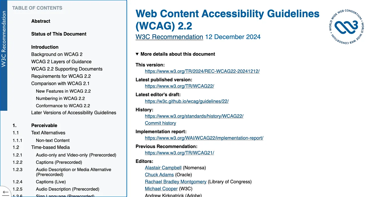
- Stay and every screen: notifications, settings, help; WCAG 2.2 accessibility and visual consistency.
Key takeaways
- Audit the journey in the order users take it; most problems hide in hand-offs between screens.
- Use Nielsen's 10 heuristics as the 'why' for usability findings and WCAG 2.2 for accessibility.
- Record evidence for every failed item: a screenshot, a measurement or a recording.
- Rate severity, then fix the few critical items first; a long unordered list rarely gets fixed.
- Re-check after fixing; an audit is a loop, not a one-off document.
A UX audit is only as good as its checklist, and most checklists online are lists of screens. Users don't experience screens; they experience a journey, and most problems hide where one step hands off to the next. This free template follows that journey, from the search result to settings, with each check tied to a principle you can cite: one of Nielsen's 10 usability heuristics, a WCAG 2.2 accessibility requirement or a behavioural law. Copy it, walk your product as a new user on desktop and mobile, and record evidence for every failure. Jump to how to use it, the checklist or how to score findings.
- Journey stages
- 6
- Checks in this template
- 60
- Nielsen heuristics behind the usability checks
- 10
- WCAG version behind the accessibility checks
- 2.2
How to use this checklist

- Choose one journey. Start with the one that makes you money: usually sign-up to first result, or browse to checkout.
- Use fresh eyes. A clean browser, a new account, on desktop and on a mid-range phone.
- Tick or fail every item. For each failure, save evidence: a screenshot, a recording or a measurement.
- Tag the principle. Note the heuristic (H1–H10), WCAG criterion or law it breaks.
- Rate severity. Use the scale at the end, then fix critical items first.
1. Arrive: first impression

- Findable — the product appears when you search its name and its main problem, on Google and in AI assistants
- One-line clarity — the landing page says what it does and for whom in the first sentence (H2)
- Primary action obvious — one clear call to action above the fold (Hick's Law)
- Pricing findable — within one click from the homepage
- Trust signals real — reviews, logos or badges that link to a source (social proof)
- Privacy and terms present — and readable
- Fast — the main content appears quickly on a mid-range phone
- Stable — nothing jumps as the page loads
- Works without errors — no console errors, broken images or dead links
- Mobile layout holds — no horizontal scrolling at 320px wide
2. Join: the first few minutes

- Sign-up asks only what's needed — no phone number or card before value, unless essential
- Social or passwordless sign-in — where your users expect it
- Clear errors — inline, specific, and they say how to fix it (H9)
- Password rules shown before failure — not after (H5)
- Account recovery works — the reset email arrives and the link works on mobile
- Email verification doesn't block value — or explains why it must
- Onboarding reaches one real result fast — the first moment of value
- Progress is visible — steps and status are shown (H1)
- Users can skip or go back — without losing work (H3)
- No empty first screen — examples, templates or sample data instead
3. Use: the everyday job
- The core task works end to end — on desktop and mobile
- Navigation matches users' words — labels in their language, not internal names (H2)
- Consistent patterns — the same action looks and works the same everywhere (H4)
- Recognition, not recall — options visible, not memorised from another screen (H6)
- Search works — tolerant of typos, with useful no-result states
- Empty states guide — say what to do next
- Loading states reassure — show progress for anything slow (H1)
- Errors help recovery — plain language, a way forward (H9)
- Destructive actions are confirmed or undoable — (H3, H5)
- Shortcuts for frequent users — without confusing new ones (H7)
- Microcopy is clear — buttons say what happens ("Save draft", not "Submit")
- Not overloaded — each screen has one main job (cognitive load, H8)
4. Pay: where value turns into revenue

- The paywall explains what's included — and what happens to the user's work
- Plans are few and comparable — highlight one recommended plan
- Price shown with tax and currency — no surprises at checkout
- Trial terms clear — when it ends, what it costs, how to cancel
- Checkout is short — the fewest possible fields
- Payment errors are specific — and keep entered details
- Works on mobile — including wallet payments where expected
- Receipts and invoices sent — and findable later
- Downgrade and cancel are possible — and honest
- No dark patterns — no hidden pre-ticked add-ons or confirm-shaming
5. Stay: what brings people back

- Notifications are useful — relevant, timely and easy to control
- Settings are findable — and grouped logically
- Account and profile editable — including email and password
- Data export or deletion available — where users expect it
- Help is in context — at the points people get stuck (H10)
- Support is reachable — and says how long a reply takes
- What's new is communicated — without blocking work
- Re-entry is easy — users can pick up where they left off
6. Every screen: accessibility and consistency
Check these on every screen against WCAG 2.2.
- Text contrast sufficient — including placeholder and disabled text
- Keyboard accessible — every action reachable and visibly focused
- Labels on every input — not just placeholders
- Images have text alternatives — decorative ones are hidden from screen readers
- Errors identified in text — not by colour alone
- Touch targets large enough — and not crowded
- Headings structured — one H1, logical order
- Motion respects reduced-motion settings — nothing flashes
- Zoom to 200% works — without losing content
- Visual consistency — type, spacing, colour and components match the design system
How to score findings
| Severity | Meaning | Fix |
|---|---|---|
| Critical | Blocks users from completing a key task | Now |
| Needs to be fixed | Causes errors or abandonment for many users | This sprint |
| Needs improvement | Slows or confuses users but they get through | Plan it |
| Recommendation | Polish or an opportunity | When convenient |
| Good | Works well; keep it | — |
Table: A five-level severity scale for UX audit findings
Order by severity, then by how many users hit the problem. A short list of critical fixes gets done; a 60-item list in no order doesn't.
The heuristics, for tagging
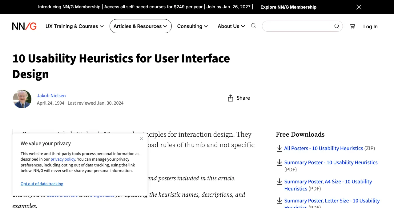
H1 Visibility of system status · H2 Match between the system and the real world · H3 User control and freedom · H4 Consistency and standards · H5 Error prevention · H6 Recognition rather than recall · H7 Flexibility and efficiency of use · H8 Aesthetic and minimalist design · H9 Help users recognize, diagnose, and recover from errors · H10 Help and documentation.
Prefer it done for you?

List your product free on Science of Apps Launchpad, and once it's live it's tested across the same journey: loaded in a real browser on desktop and mobile, measured automatically and reviewed by experts, with every finding backed by evidence, rated on the five verdicts above and approved by an analyst.
- Areas tested
- 22
- Automatic measurements
- 39
- Expert checks behind your login
- 74
- Verdicts that rank what to fix first
- 5
Ready to audit?
How we built this template
The usability checks map to Nielsen's 10 usability heuristics (Nielsen Norman Group), the accessibility checks to the W3C's WCAG 2.2 Recommendation, and the journey to the stages Science of Apps uses in its product investigations. It's a starting template, not a compliance certification; for legal accessibility conformance, test against the full WCAG success criteria.
Key terms, defined
- UX audit checklist: a list of checks used to review a product's usability and accessibility consistently.
- Heuristic (H1–H10): one of Nielsen's 10 usability principles.
- WCAG 2.2: the W3C's Web Content Accessibility Guidelines, version 2.2.
- Severity: how badly a problem blocks users, used to order fixes.
- Dark pattern: an interface trick that pushes users into choices they didn't intend.
Frequently asked questions
What should a UX audit checklist include?
Checks for every stage of the user journey: findability and first impression, sign-up and onboarding, the core task, payment and upgrade, retention features and accessibility on every screen. Each item should map to a principle, such as one of Nielsen's 10 usability heuristics or a WCAG 2.2 criterion, so findings are explainable.
How do I do a UX audit with a checklist?
Pick the journeys that matter most (usually sign-up and the core task), walk them as a new user on desktop and mobile, tick each check, and for every failure save evidence and note a severity. Then sort by severity and fix the critical items first.
What's the difference between a UX audit and a heuristic evaluation?
A heuristic evaluation checks an interface against usability principles such as Nielsen's 10 heuristics. A UX audit is broader: it usually includes a heuristic evaluation plus accessibility checks, performance measurements, analytics and a review of the whole journey.
How long does a checklist-based UX audit take?
For one key journey on one platform, a few hours. For a full product on desktop and mobile, a few days. Start with the journey that makes you money.
Can a UX audit be automated?
Partly. Speed, some accessibility checks and broken links can be measured automatically. Judging clarity, flow and trust needs a person walking the product. The most useful audits combine both, with every finding reviewed before it's acted on.
How do I prioritise UX audit findings?
Rate each by severity (how badly it blocks users) and reach (how many users hit it). Fix critical blockers on high-traffic paths first, then high-reach annoyances, then polish.
Sources
- Nielsen Norman Group — 10 usability heuristics for user interface design (Jakob Nielsen, 1994; reviewed 2024)
- W3C — Web Content Accessibility Guidelines (WCAG) 2.2, W3C Recommendation
- Science of Apps — Product investigation: what we investigate and how
- Science of Apps — Launchpad: launch your product free
- Checked November 17, 2026. Figures that change — fees, salaries, prices — are reviewed every six months; if something is out of date, tell us.
Where to go from here
- What is a UX audit? — what it is and how to get one free
- The Laws of UX — the principles behind each check
- Product Hunt launch checklist — the checklist for launch day
- Science of Apps - LaunchpadHow to do a UX audit of your website in one day: the eight steps, the standards to check against, the free tools, and how to turn findings into a fix listHow to do a UX audit in one day: set goals, walk the journey, check Nielsen's heuristics and WCAG 2.2, measure speed, read analytics and rank the fixes.
- Science of Apps - LaunchpadHeuristic evaluation explained for founders: Nielsen's 10 usability heuristics with startup examples, how to run one in an afternoon, and how to rate what you findWhat a heuristic evaluation is, Nielsen's 10 heuristics with startup examples, how to run one with 3–5 reviewers, and how to rate severity from 0 to 4.
- Science of Apps - LaunchpadWhat is a UX audit? What it checks, how it's done, what you get, and how to get one for freeA UX audit is a structured review of where users struggle in your product. What it checks, the standards behind it, what you get, and how to get one free.
- Science of Apps - LaunchpadA landing page review checklist for startups: 36 evidence-based checks for clarity, trust, speed, mobile and the call to action, with the research behind eachA landing page review checklist for startups: 36 checks for the first 10 seconds, trust, speed, mobile and the call to action, from NN/g and Google research.
- Science of Apps - LaunchpadSaaS audit checklist: 100 checks across 22 areas of the customer journey, from discoverability and sign-up to the paywall, retention and accessibility, plus a SaaS health check of the numbersA SaaS audit checklist with 100 checks across 22 areas, from discoverability and sign-up to paywall, retention and accessibility, plus a SaaS health check.
- Science of Apps - LaunchpadWhat a 360-degree product audit is: every stage of the customer journey, measured and checked by experts, with five verdicts and a priority order, and how to get one freeA 360 degree product audit checks every stage of the journey, from first visit to renewal, with measurements, expert checks and verdicts. What it covers.
Get the ideas, not the noise.
Sign up with Google and we’ll send you short UX psychology tips by email — why people tap, stall and leave, and what to do about it. Unsubscribe anytime. Prefer something to keep? Get the free Laws of UX guide as a PDF.
Launch day ends. Your listing shouldn't.
Prefer it done for you? List your product free and, once it's live, it's tested end to end across 22 areas with 39 automatic measurements and 74 expert checks, with a detailed report.