 By
Quick answer: What makes a landing page convert?
- 10 seconds: say what it is, for whom and why it's better.
- One action: a single primary call to action, repeated.
- Real proof: named customers, numbers, screenshots, linked reviews.
- Fast: LCP within 2.5 s, INP within 200 ms, CLS under 0.1.
- Mobile: no horizontal scroll; tap targets you can hit.
Key takeaways
- Clarity beats cleverness in the headline.
- Each extra choice slows the decision; keep one main action.
- Proof works only when it's specific and verifiable.
- Speed is measurable; Google publishes the thresholds.
- Review with fresh eyes on a real phone, not your laptop.
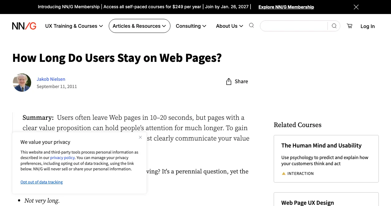
You built the page, so you can't see it. You know what "AI-native workflow orchestration" means; the founder in Pune who lands from a Reddit link doesn't, and gives you a few seconds to explain. Jakob Nielsen's research at NN/g found users often leave web pages in 10–20 seconds, and that pages need to communicate their value proposition within 10 seconds to hold attention for longer. This checklist turns that into 36 checks you can run on your own landing page in under an hour, each tied to published research or a measurable threshold, as read on 17 November 2026. Jump to the first 10 seconds, speed or how to review.
- How quickly users often leave a page (NN/g)
- 10–20 s
- To communicate your value proposition
- 10 s
- Largest Contentful Paint target (Google)
- 2.5 s
- Checks in this list
- 36
How to run a landing page review

- Use fresh eyes — a private browser window on a real mid-range phone, then a laptop.
- Do a five-second test — show the page to five people from your audience for five seconds; ask what it does and for whom.
- Tick or fail each check — screenshot every failure.
- Measure speed — run the page through PageSpeed Insights.
- Watch real visits — a week of session recordings shows where people stop.
- Fix in order — headline, call to action, proof, speed, then everything else.
1. The first 10 seconds

- Headline says what it is — "Invoicing for freelancers in India", not "Work, reimagined"
- Who it's for is explicit — a role, a business type or a situation
- Why it's better — one concrete difference, ideally a number
- A product visual — a real screenshot or short clip, not an abstract illustration
- One primary call to action above the fold — on a phone, too
- The button says what happens — "Start free trial", not "Submit"
- No jargon in the first screen — words your users use (Jakob's Law)
- Nothing moves or pops up before they've read — no instant modals
2. The call to action

- One primary action — repeated down the page, same wording (Hick's Law)
- Visually distinct — the strongest contrast on the page
- Low commitment stated — "No card needed", "Free plan", only if true
- Short form — ask only what you need now
- Clear next step after clicking — what happens, and how long it takes
- Works on mobile — tap target big enough, not hidden behind a cookie banner
3. Trust and proof

- Specific proof — named customers, real numbers, dated results (social proof)
- Verifiable — reviews and badges link to their source
- No fake scarcity — timers and "only 3 left" only when true
- Real people behind it — a founder name, an About page, a way to contact you
- Pricing findable — on the page or one click away
- Privacy policy and terms — linked in the footer
- Security signals where it matters — for payments or sensitive data, say how it's handled
4. Speed and stability
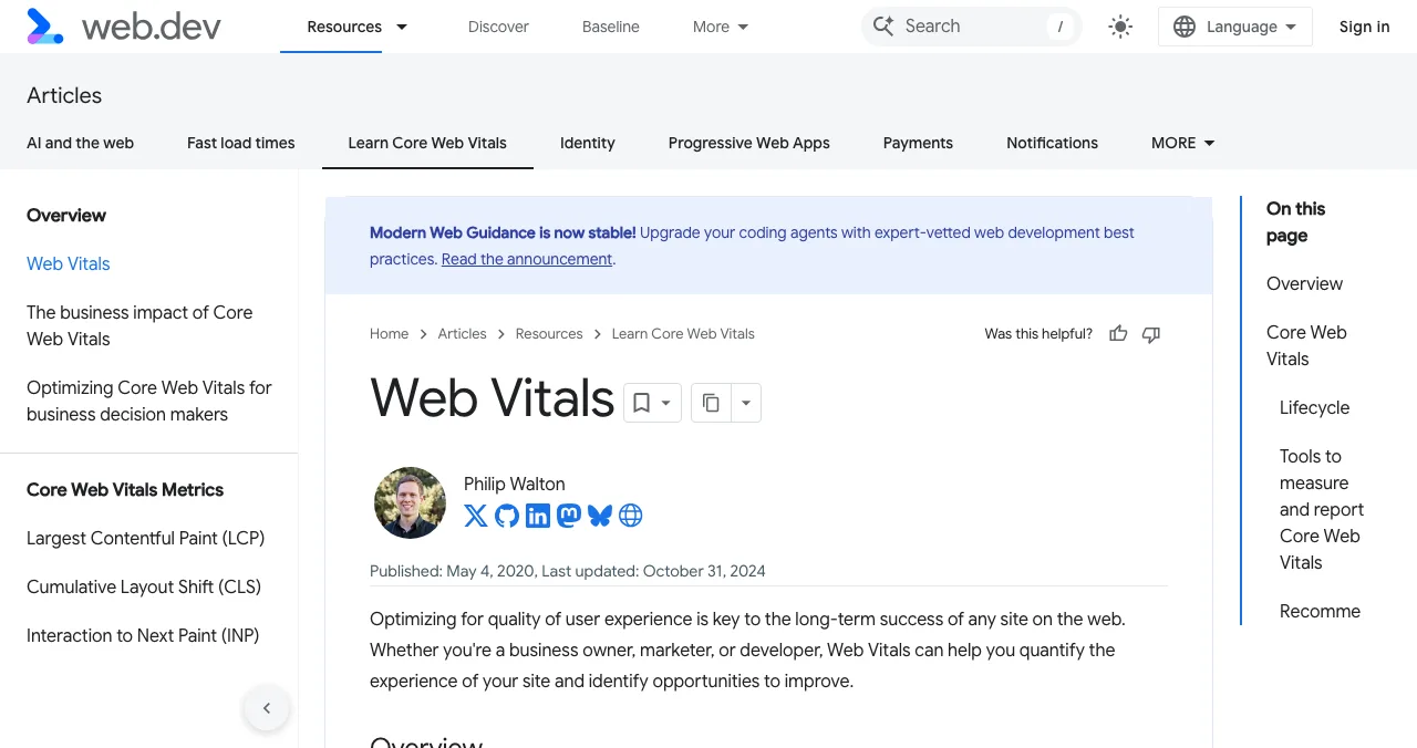
Measure, don't guess. Google's Core Web Vitals give three thresholds, judged at the 75th percentile of page loads on mobile and desktop.
| Metric | What it measures | Good |
|---|---|---|
| Largest Contentful Paint (LCP) | Loading: when the main content appears | Within 2.5 s |
| Interaction to Next Paint (INP) | Responsiveness to taps and clicks | 200 ms or less |
| Cumulative Layout Shift (CLS) | Visual stability: things jumping | 0.1 or less |
Table: Core Web Vitals thresholds for a landing page (web.dev, checked 17 Nov 2026)

- Hero image compressed — WebP or AVIF, sized for the screen
- No layout jumps — images and embeds have reserved space
- Fonts don't block text — text visible while fonts load
- Few third-party scripts — every chat widget and tracker costs time
- Tested on mobile data — not just office Wi-Fi
5. Mobile and accessibility
- No horizontal scroll at 320 px wide
- Text readable without zooming — and sufficient colour contrast (WCAG 2.2)
- Tap targets well spaced — buttons not crammed together (Fitts's Law)
- Images have alt text — especially the product screenshot
- Keyboard works — you can reach and press the main button with Tab and Enter
- Video has captions — and doesn't autoplay with sound
6. Findability
- Title tag says what it is — the same promise as the headline
- Meta description answers the query — what, for whom, why
- Indexed — check in Google Search Console
- Shareable — an Open Graph image and title for links in WhatsApp, LinkedIn and X
Mistakes we see most
- A clever headline nobody understands — clarity first
- Three equal buttons — "Book a demo", "Start free" and "Contact sales" side by side
- Logos with no permission or link — proof that can't be checked hurts trust
- A 4 MB hero video — beautiful on fibre, blank on a phone
- Reviewing on your own laptop — test where your users are
Ready for a second pair of eyes?
How we built this checklist
The attention figures come from Jakob Nielsen's NN/g article on how long users stay on web pages; speed thresholds from web.dev's Web Vitals article; accessibility checks from WCAG 2.2; all read on 17 November 2026. The order of fixes and the checks themselves are our editorial recommendation, informed by the Laws of UX linked above.
Key terms, defined
- Value proposition: what you offer, for whom, and why it's better.
- Call to action (CTA): the button or link that asks for the next step.
- Five-second test: showing a page briefly and asking what it's about.
- Core Web Vitals: Google's three metrics for loading, responsiveness and stability.
- Above the fold: what's visible before scrolling.
Frequently asked questions
What makes a landing page convert?
A clear promise in the first lines (what it is, for whom, why it's better), one obvious next step, specific proof, fast loading and a layout that works on a phone. NN/g's research suggests the value proposition must land within about 10 seconds.
How do I review my landing page?
Use a checklist like this one, on a phone and a laptop, in a fresh browser. Then show the page to five people from your audience for five seconds each and ask what the product does. If they can't say, fix the headline first.
Where can I get my landing page roasted?
Founder communities and roast threads give fast opinions. For evidence, combine a checklist with real-user recordings (Microsoft Clarity is free) and speed data from PageSpeed Insights. Our roast-my-landing-page guide lists places to ask.
How fast should a landing page load?
Google's Core Web Vitals say Largest Contentful Paint should happen within 2.5 seconds, Interaction to Next Paint should be 200 ms or less and Cumulative Layout Shift 0.1 or less, at the 75th percentile of visits.
How many calls to action should a landing page have?
One primary action, which you can repeat down the page, plus at most a quieter secondary one (such as 'see pricing'). More competing choices make the decision slower, which is Hick's Law.
What is a good landing page conversion rate?
It depends heavily on traffic source, price and audience, so published averages compare unlike pages. Track your own rate per traffic source and improve it against itself.
Sources
- Nielsen Norman Group — How Long Do Users Stay on Web Pages? (Jakob Nielsen, 11 Sep 2011; checked 17 Nov 2026)
- web.dev — Web Vitals (checked 17 Nov 2026)
- Google — PageSpeed Insights
- W3C — Web Content Accessibility Guidelines (WCAG) 2.2
- Microsoft Clarity (checked 17 Nov 2026)
- Checked November 17, 2026. Figures that change — fees, salaries, prices — are reviewed every six months; if something is out of date, tell us.
Where to go from here
- Roast my landing page — where to get feedback
- Laws of UX — the principles behind the checks
- Write your one-liner — the headline
- Science of Apps - LaunchpadRoast my landing page: 25 fixes founders hear in landing page roasts, each with the principle that explains itRoast my landing page, done properly: 25 landing page fixes for headlines, CTAs, pricing, trust and speed, each tied to a usability or behavioural principle.
- Science of Apps - LaunchpadA free website UX audit for startups: the five things to check first (findability, clarity, speed, accessibility, the sign-up path) with the free tools that measure eachA free website UX audit for startups: check findability, clarity, speed, accessibility and the sign-up path first, with free Google, WebAIM and Microsoft tools.
- Science of Apps - LaunchpadThe best UX audit tools for startups, free and paid: what each one actually checks (behaviour, speed, accessibility, research) and the gaps no tool fillsThe best UX audit tools for startups, free and paid: Clarity, PageSpeed Insights, WAVE, Hotjar, Maze and an end-to-end product test, with what each checks.
- Science of Apps - LaunchpadThe UX audit checklist: a free, journey-based template for websites and apps, built on Nielsen's heuristics and WCAG 2.2A free UX audit checklist for websites and apps: 60 checks across the user journey, from first impression to payment, using Nielsen's heuristics and WCAG 2.2.
- Science of Apps - LaunchpadHow to market an AI tool in 2027: positioning by task, AI directories, AI search, demos and the trust that makes people payHow to market an AI tool in 2027: position by task, list in AI directories, get cited by AI search, show real outputs and earn trust that converts.
- Science of Apps - LaunchpadRoast my startup: the best places to get brutally honest feedback, and how to post so the roast is usefulWhere to get your startup roasted in 2027: r/roastmystartup, Show HN, Indie Hackers, Microlaunch and an evidence-based product test, and how to post.
Get the ideas, not the noise.
Sign up with Google and we’ll send you short UX psychology tips by email — why people tap, stall and leave, and what to do about it. Unsubscribe anytime. Prefer something to keep? Get the free Laws of UX guide as a PDF.
Launch day ends. Your listing shouldn't.
List free on the Launchpad and, once your listing is live, get a free report on your landing page, discoverability and speed; deeper screen-by-screen reports are available.