 By
Quick answer: What should I fix on my landing page?
- Headline: say what it does and for whom; no slogans.
- Proof of product: a real screenshot or demo above the fold.
- One action: one primary call to action, repeated, never competing.
- Pricing: within one click; no 'contact us' unless you must.
- Trust: real reviews, logos or badges that link to a source.
- Speed and mobile: fast on a mid-range phone, no layout jumps.
Key takeaways
- The headline does most of the work: if a visitor can't say what you do after five seconds, nothing below it matters.
- Show the product in use; screenshots and short demos beat illustrations.
- One primary call to action converts better than several competing ones; more choices slow decisions (Hick's Law).
- Proof must be checkable: named customers, linked reviews and real numbers, never invented ones.
- Fix the page, then get it roasted again; one round of fixes rarely catches everything.
Post a landing page to a "roast my startup" thread and you'll hear the same handful of things: "I don't know what this does", "where's the pricing?", "too many buttons", "is anyone actually using this?". They come up again and again because they break a few well-known principles. This guide lists 25 landing page fixes, grouped by part of the page, each with the principle that explains it, so you can fix the cause, not just the comment. Jump to the headline, proof, pricing or speed.
- To pass the "what does it do?" test
- 5 sec
- Primary call to action
- 1
- Maximum distance to pricing
- 1 click
- Fixes, each with its principle
- 25
The headline and first screen

- 1. Say what it does — "Turns support tickets into a weekly bug report" beats "Customer intelligence, reimagined" (Nielsen H2: match the real world)
- 2. Say who it's for — "for product teams" filters the right visitors in
- 3. Show the product in use — a real screenshot or 20-second demo above the fold, not an abstract illustration
- 4. One primary call to action — "Start free", repeated down the page (Hick's Law)
- 5. Make the action say what happens — "Start free trial, no card" beats "Get started"
- 6. Remove the carousel — rotating headlines hide your message from most visitors
Clarity and copy

- 7. Cut the jargon — use your customers' words, not your internal ones (cognitive load)
- 8. Lead sections with outcomes — what the user gets, then the feature that delivers it
- 9. Keep each section to one idea — scanning readers take one message per block (Nielsen H8)
- 10. Answer the obvious objection — "Does it work with X?", "Is my data safe?", near the top
- 11. Use real numbers — "imports 10,000 rows in a minute (our test)", never invented ones
Proof and trust

- 12. Show real social proof — named quotes, real logos, linked reviews (social proof)
- 13. Make badges checkable — launch and review badges should link to their source
- 14. Show the people — founders' names and faces build trust for a new product
- 15. Be specific about security and privacy — what you store, where, and who sees it
- 16. Never fake it — invented testimonials or user counts destroy trust when found
Pricing and sign-up

- 17. Pricing within one click — or a starting price, if you must use "contact sales"
- 18. Few, comparable plans — highlight one recommended plan
- 19. State the trial terms — length, card or no card, how to cancel
- 20. Ask for less at sign-up — email and password, or social sign-in; the rest later
Speed, mobile and accessibility
- 21. Load fast on a mid-range phone — test on mobile data, not office Wi-Fi
- 22. No layout jumps — reserve space for images and embeds
- 23. Readable contrast and sizes — meet WCAG 2.2 contrast; no grey-on-grey
- 24. Tappable buttons — large enough, not crowded together
- 25. Works at 320px wide — no sideways scrolling
What a roast can't tell you
Strangers can judge your pitch in a few seconds. They can't tell you what happens after the click: whether sign-up works on mobile, how long the page takes on a real phone, or whether people find you on Google and AI assistants in the first place. That needs testing.
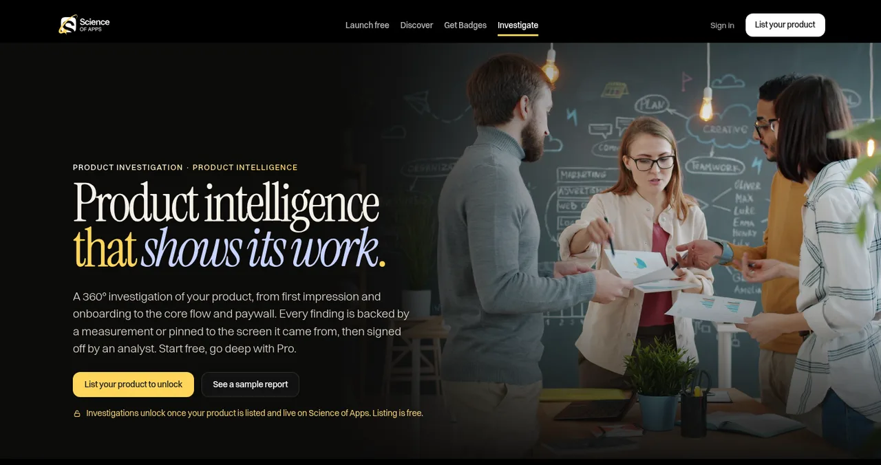
List your product free on Science of Apps Launchpad. Once your listing is live, the free report covers your landing page, discoverability and speed with quick fixes. Economy and Premium reports go further, testing every screen behind your landing page, with findings backed by evidence and approved by an analyst.
Make your product live. Get it diagnosed today.
Start with the free landing page report, then go deeper when you're ready.

 Economy
See what new customers see
- Store listing and homepage, screen by screen
- Scorecard against 60 Laws of UX
- Customers, competitors and the fixes worth most
PremiumThe full diagnosis and the plan
- Every screen, every finding, every flow
- All 60 laws with evidence and fixes
- 8 strategy chapters and a 90-day roadmap
Both reports are researched from your live product and fact-checked against the evidence before they reach you.
How to ask for a landing page roast

- Fix the obvious first — work through the 25 above, so the roast focuses on hard questions.
- Post where your audience is — Roast my startup lists the places.
- Ask three specific questions — "Is the headline clear?", "Would you click Start free?", "What's missing before you'd pay?"
- Reply to everything — and look for patterns; three people on the same issue is a fix.
- Change one thing at a time — and measure sign-ups before and after.
Ready for an honest look?
How we know
Each fix maps to a published principle: Nielsen's 10 usability heuristics (Nielsen Norman Group), WCAG 2.2 accessibility (W3C), and behavioural principles from our Laws of UX library. The tagline test is from Product Hunt's launch guide. We don't quote conversion uplifts, because they vary too much between products to generalise. Science of Apps runs the Launchpad and the reports described.
Key terms, defined
- Landing page: the page a visitor lands on from an ad, launch or search, built for one action.
- Above the fold: what's visible before scrolling.
- Call to action (CTA): the button or link you want visitors to use.
- Social proof: evidence that other people use and trust a product.
- Hick's Law: more choices make decisions slower.
Frequently asked questions
Where can I get my landing page roasted?
r/roastmystartup and Indie Hackers for blunt comments from strangers and founders, Show HN if people can try the product, and Microlaunch, whose launches collect 'roasts'. For an evidence-based review, list your product free on Science of Apps Launchpad; the free report covers your landing page, discoverability and speed.
What makes a good landing page headline?
It says what the product does and who it's for in plain words: 'Meeting notes that write themselves for sales teams', not 'The future of productivity'. Product Hunt uses the same test for taglines: if someone reads only the name and tagline, do they know what it does?
How many calls to action should a landing page have?
One primary action, repeated down the page, plus at most one quieter secondary action such as 'See pricing'. Competing calls to action split attention and slow decisions.
Should I show pricing on my landing page?
Usually, yes, or within one click. Visitors who can't find a price often leave rather than ask. If you must use 'contact sales', give a starting price or a range.
What social proof should a startup use?
Anything real and checkable: named customer quotes with permission, logos of actual users, links to reviews on independent sites, launch badges that link back, or usage numbers you can stand behind. Never invent testimonials or numbers.
How fast should a landing page load?
Fast enough that the main content appears almost immediately on a mid-range phone over mobile data, and nothing jumps as it loads. Test on a real phone, not just a fast laptop.
Sources
- Nielsen Norman Group — 10 usability heuristics for user interface design (Jakob Nielsen, 1994; reviewed 2024)
- W3C — Web Content Accessibility Guidelines (WCAG) 2.2, W3C Recommendation
- Product Hunt Help Center — Build your product page: the tagline test (checked 17 Nov 2026)
- Science of Apps — Product investigation: what we investigate and how
- Science of Apps — Launchpad: launch your product free
- Checked November 17, 2026. Figures that change — fees, salaries, prices — are reviewed every six months; if something is out of date, tell us.
Where to go from here
- Roast my startup — where to get honest feedback
- UX audit checklist — the full journey, beyond the landing page
- The Laws of UX — the principles behind each fix
- Science of Apps - LaunchpadHow to use Indie Hackers to launch and grow: what the community rewards, what to post, and how it fits with Product Hunt and Show HNHow to use Indie Hackers to launch: what the founder community rewards, posts that work, mistakes that get ignored, and where it fits with other launches.
- Science of Apps - LaunchpadHow to launch a SaaS product in 2027: from private beta to public launch to the first paying customersHow to launch a SaaS in 2027, step by step: private beta, pricing, onboarding that activates, a permanent page, launch days, and turning trials into customers.
- Science of Apps - LaunchpadDealroom vs Crunchbase: seat-based ecosystem data from €250 a seat versus self-serve plans from $49, and which one fits founders, investors and governmentsDealroom vs Crunchbase: Dealroom from €250 per seat a month with a 3-seat minimum; Crunchbase self-serve from $49 with a free account. Who each suits.
- Science of Apps - LaunchpadPre-launch marketing for startups: a six-week plan from waitlist to launch day, with the channels, assets and rules that matterPre-launch marketing for startups: a 6-week plan with a waitlist, building in public, early adopters, launch assets and a scheduled launch date.
- Science of Apps - LaunchpadThe Product Hunt launch mistakes that kill your ranking, or your launch, and how to avoid each oneThe Product Hunt launch mistakes that hurt ranking or get launches removed: asking for upvotes, new-account votes, vague taglines, broken flows and more.
- Science of Apps - LaunchpadRoast my startup: the best places to get brutally honest feedback, and how to post so the roast is usefulWhere to get your startup roasted in 2027: r/roastmystartup, Show HN, Indie Hackers, Microlaunch and an evidence-based product test, and how to post.
Get the ideas, not the noise.
Sign up with Google and we’ll send you short UX psychology tips by email — why people tap, stall and leave, and what to do about it. Unsubscribe anytime. Prefer something to keep? Get the free Laws of UX guide as a PDF.
Launch day ends. Your listing shouldn't.
List your product free and, once it's live, your landing page, discoverability and speed are tested in the free report, with deeper reports covering every screen behind it.