Decoy Effect
Also known as Asymmetric dominance effect
Adding a third option that is clearly worse than one choice but similar in price makes that choice look more attractive.
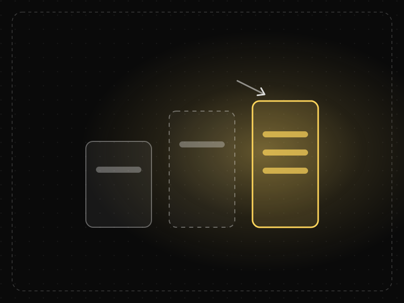
See it in action
The same screen without and with Decoy Effect. Watch both sides play out, then compare the outcome.
In Dan Ariely's Economist test, 68% chose web-only when it was a two-way choice.
Add an obviously worse “print only” at the same price and 84% chose print + web — nobody chose the decoy.
What to watch: nobody picks the middle option, yet it moves most people to the right-hand plan.
Use plan structure to make the best-value option easy to recognise.
Add fake tiers designed only to manipulate; people notice and stop trusting your pricing.
Key takeaways
- The options around a choice change how valuable it seems.
- A deliberately inferior option can steer users toward a target option.
- Use comparisons to clarify value, not to trick people.
Quick facts
- Also known as
- Asymmetric dominance effect
- Described by
- Joel Huber, John Payne & Christopher Puto
- Year
- 1982
- Category
- Decision-making
- Related laws
- Anchoring Effect, Choice Overload, Framing Effect
Decoy Effect explained
The decoy effect occurs when people choose between two options and a third option is added that is worse than one of them (the target) in every way, but only partly worse than the other.
The decoy makes the target look clearly superior by comparison, which shifts choices toward it. People make relative judgements rather than evaluating each option on its own merits.
In product design, this explains why the set of plans or bundles shown matters as much as their individual prices.
Where it comes from
Joel Huber, John Payne and Christopher Puto described the asymmetric dominance effect in 1982. Dan Ariely popularised it with an example of a magazine offering web-only, print-only and print-plus-web subscriptions where the print-only option existed mainly to make the bundle look like a bargain.
How it shows up in apps
Pricing pages, plan comparisons and product bundles often include a middle option that makes another look like great value. Even without intent, the options you offer change which one users pick.
Decoy Effect examples
A video app offers Basic at $8, Standard at $15 and Premium at $16. Standard lacks most of Premium's features but costs almost the same, so most buyers upgrade to Premium.
Subscription tiers
A middle tier priced close to the top tier but with far fewer features makes the top tier look like the obvious choice.
Drink sizes
Cinemas offer a medium popcorn priced close to the large, so the large feels like better value.
Storage plans
Cloud storage pricing sometimes offers a small upgrade at a price close to a much larger plan, nudging users to the bigger plan.
How to apply Decoy Effect
- Review how each option in a set affects the perceived value of the others.
- Design plans so that the recommended option offers clear value.
- Use comparison tables to make trade-offs transparent.
- Test different plan sets to understand how choices shift.
- Ensure every option is genuinely useful to someone.
Want Decoy Effect checked in your own product? Our saas ux audit evaluates it alongside the other principles that shape how users decide, onboard and stay.
Common mistakes
- Creating useless options purely to manipulate.
- Making comparisons confusing so users cannot see true value.
- Ignoring how existing plans already act as unintended decoys.
How to measure it
A/B test plan sets and measure the distribution of choices, revenue per user and later satisfaction and churn. A decoy that boosts sales but increases cancellations is not working for users.
Frequently asked questions
What is Decoy Effect?
Adding a third option that is clearly worse than one choice but similar in price makes that choice look more attractive.
Where does Decoy Effect come from?
Joel Huber, John Payne and Christopher Puto described the asymmetric dominance effect in 1982. Dan Ariely popularised it with an example of a magazine offering web-only, print-only and print-plus-web subscriptions where the print-only option existed mainly to make the bundle look like a bargain.
How does Decoy Effect apply to app design?
Pricing pages, plan comparisons and product bundles often include a middle option that makes another look like great value. Even without intent, the options you offer change which one users pick.
What is an example of the decoy effect?
A medium popcorn priced almost the same as a large one makes the large look like a great deal, increasing sales of large popcorn.
Is the decoy effect a dark pattern?
It can be if the decoy is designed only to manipulate. Used to clarify genuine differences in value, it is a standard pricing practice.
How do you measure Decoy Effect in a product?
A/B test plan sets and measure the distribution of choices, revenue per user and later satisfaction and churn. A decoy that boosts sales but increases cancellations is not working for users.
Sources
- Huber, J., Payne, J. W., & Puto, C. (1982). Adding asymmetrically dominated alternatives: Violations of regularity and the similarity hypothesis. Journal of Consumer Research, 9(1). Find on Google Scholar ↗
- Ariely, D. (2008). Predictably Irrational. HarperCollins. Find on Google Scholar ↗
Related laws
 Decision-making
Anchoring Effect
The first number or piece of information people see becomes a reference point that strongly influences how they judge everything after it.
 Decision-making
Choice Overload
When people face too many options, deciding becomes harder and less satisfying — and they are more likely to choose nothing at all.
 Decision-making
Framing Effect
The same information leads to different decisions depending on how it is presented — for example, as a gain or as a loss.
Decoy Effect in practice
- Making moneyIn-app purchase pricing: how top apps set their prices, and how to set yoursIn-app purchase pricing explained: regional prices for India, store price points, tiers and bundles, anchoring and decoys, trials and how to test prices safely.
- Making moneyApp monetization strategies that don't annoy users — designed with behavioural scienceMonetize your app without wrecking retention: value-first paywalls, honest trials, rewarded ads, anchoring and decoy pricing done ethically, and what to avoid.
- Career guidesStrategic decision-making skills employers want in 2027: framing choices, options and criteria, scenarios, reversibility, expected value, pre-mortems and group biasesStrategic decision-making skills for 2027: framing choices, options, criteria, scenarios, reversibility, expected value, pre-mortems and avoiding group bias.
- Making moneySubscription vs one-time purchase: which makes more money for your app?Subscription vs one-time purchase for apps: lifetime value maths, when each wins, hybrid models, store fees and what Indian users prefer.
- Making moneyHow to earn money from an app: a realistic guide for Indian buildersHow to earn money from an app realistically: pick a model that fits your users, set up payments, price for India and abroad, and grow revenue per user.
- Architecture & engineeringThe best airports in the world in 2026, and the design science that makes them easy to useThe best airports in the world in 2026, led by Singapore Changi, and the design behind them: wayfinding, short walks, daylight and the psychology of waiting.
Certifications that test it
- Free certification · UX/UI, Design, Research & CreativeBehavioral Design CertificationCertifies that you can apply behavioral psychology and behavioral economics to product design ethically — motivation, decision architecture, habits and the laws of UX.
- Free certification · Digital Marketing, SEO, AEO & GrowthConversion Rate Optimization (CRO) CertificationCertifies that you can find and fix conversion leaks with evidence — funnel analysis, research, hypothesis design, A/B testing and landing-page and checkout UX.
- Free skill test · 10 minCognitive Bias TestA 10-minute test of cognitive biases: how anchoring, loss aversion, defaults, decoys and framing shape users' choices, and how confirmation bias, sunk costs and the planning fallacy distort team decisions.

Get the ideas, not the noise.
Sign up with Google and we’ll send you short UX psychology tips by email — why people tap, stall and leave, and what to do about it. Unsubscribe anytime. Prefer something to keep? Get the free Laws of UX guide as a PDF.