Von Restorff Effect
Also known as Isolation Effect
When several similar items are present, the one that differs from the rest is the one most likely to be noticed and remembered.
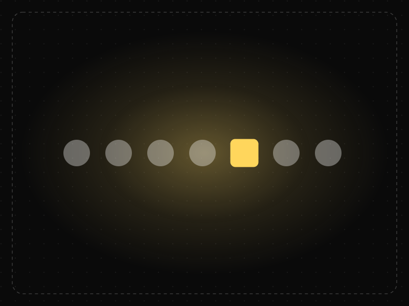
See it in action
The same screen without and with Von Restorff Effect. Watch both sides play out, then compare the outcome.
The failed payment blends into routine notices; people scroll past it.
Distinct colour and weight make the one important item impossible to miss.
What to watch: how fast the eye (and finger) reach the item once it's different from its neighbours.
Make the single most important element visually distinct — and keep it to one.
Highlight everything; when every item is special, nothing stands out.
Key takeaways
- Make the primary action visually distinct from everything else.
- Use contrast sparingly — if everything stands out, nothing does.
- Don't rely on color alone; combine it with size, shape or position for accessibility.
Quick facts
- Also known as
- Isolation Effect
- Described by
- Hedwig von Restorff
- Year
- 1933
- Category
- Memory & attention
- Related laws
- Law of Similarity, Selective Attention, Serial Position Effect
Von Restorff Effect explained
The Von Restorff effect, or isolation effect, predicts that when multiple similar objects are present, the one that differs from the rest is most likely to be noticed and remembered.
Differences can be in colour, size, shape, position, motion or style. The more an item stands out against its surroundings, the more attention it attracts.
Designers use this to highlight primary actions and important information. Because it depends on contrast, it only works when used sparingly: if everything stands out, nothing does.
Where it comes from
Named after German psychiatrist and pediatrician Hedwig von Restorff, whose 1933 experiments showed that an item isolated from a list by being different was remembered much better than the rest.
How it shows up in apps
Highlighting the recommended plan, the primary button or a new feature works because of this effect — and fails when several elements compete for attention.
Von Restorff Effect examples
On a plan picker, only the recommended plan gets a gold border and a 'Best value' badge, so it's the one most users notice and choose.
Primary buttons
A single filled, high-contrast button among outlined secondary buttons makes the main action obvious.
Recommended pricing plan
Pricing pages highlight one plan with a different colour, a badge or a raised card, drawing attention to the option most customers should choose.
Unread indicators
Messaging apps use a bold font or a coloured dot to make unread conversations stand out in an otherwise uniform list.
How to apply Von Restorff Effect
- Make the single most important element on each screen visually distinct.
- Use restraint: limit highlighted elements so they keep their impact.
- Do not rely on colour alone; combine it with shape, size, text or icons.
- Be careful with motion; animated elements attract attention but can distract and affect users with vestibular disorders.
- Ensure highlighted elements do not look like ads, which users ignore.
Want Von Restorff Effect checked in your own product? Our saas ux audit evaluates it alongside the other principles that shape how users decide, onboard and stay.
Common mistakes
- Highlighting too many elements, so none stands out.
- Making secondary or destructive actions more prominent than the primary one.
- Relying solely on colour, which fails for colour-blind users.
How to measure it
Use click-through rates, heatmaps and eye-tracking to see whether highlighted elements get attention. A/B test different treatments of the primary action and measure conversion.
Frequently asked questions
What is Von Restorff Effect?
When several similar items are present, the one that differs from the rest is the one most likely to be noticed and remembered.
Where does Von Restorff Effect come from?
Named after German psychiatrist and pediatrician Hedwig von Restorff, whose 1933 experiments showed that an item isolated from a list by being different was remembered much better than the rest.
How does Von Restorff Effect apply to app design?
Highlighting the recommended plan, the primary button or a new feature works because of this effect — and fails when several elements compete for attention.
Who discovered the Von Restorff effect?
German psychologist Hedwig von Restorff described it in 1933 after finding that an item isolated from others in a list was remembered better.
How is the Von Restorff effect used in UX?
Designers make key actions and information visually distinct (through colour, size or shape) so they are noticed and remembered.
How do you measure Von Restorff Effect in a product?
Use click-through rates, heatmaps and eye-tracking to see whether highlighted elements get attention. A/B test different treatments of the primary action and measure conversion.
Sources
- von Restorff, H. (1933). Über die Wirkung von Bereichsbildungen im Spurenfeld. Psychologische Forschung, 18. Find on Google Scholar ↗
Related laws
 Perception
Law of Similarity
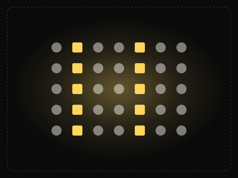
Elements that look alike — in color, shape, size or style — are perceived as related or as having the same function.
 Memory & attention
Selective Attention
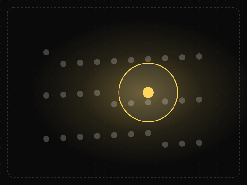
People focus on the small part of their environment related to their current goal and filter out the rest — including things designers want them to notice.
 Memory & attention
Serial Position Effect
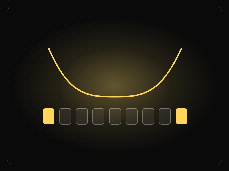
People best remember the first and last items in a series and tend to forget the ones in the middle.
Von Restorff Effect in practice
- Everyday design scienceWhy are traffic lights red, yellow and green? The railway history and the science of seeing themTraffic lights are red, yellow and green because road signals copied railway signals. The history, the physics of each colour and how colour-blind drivers cope.
- Career guidesDashboard design and KPI skills for BI and analyst jobs in 2027: what employers test and how to build dashboards people useDashboard design and KPI skills for BI and analyst jobs in 2027: choosing KPIs, leading vs lagging, layout and context, interview tasks and a plan.
- UI/UX designColour psychology in design: what the research supports, and how to use colour in appsColour psychology in app design without the myths: what research supports, cultural meanings in India, colour for hierarchy and state, and contrast.
- Architecture & engineeringIndian temple architecture explained: Nagara, Dravida and Vesara, and how to read any templeThe three types of Indian temple architecture, Nagara, Dravida and Vesara, explained with diagrams: a temple's parts, its plan grid and famous examples.
- Career guidesData visualisation jobs and skills in 2027: what employers test, the portfolio that wins and the chart mistakes that lose offersData visualisation jobs and skills in 2027: which roles need them, how employers test chart judgement, a portfolio that wins, interview questions and a plan.
- Career guidesHow to get a UX designer job in 2027: the hiring playbook, from the other side of the deskHow to get a UX designer job in 2027: what recruiters screen for, the interview loop, a portfolio that survives a 30-second look, pay and a 12-week plan.


Certifications that test it
- Free certification · UX/UI, Design, Research & CreativeUI Design CertificationCertifies that you can design clear, consistent, accessible interfaces — visual hierarchy, typography, colour, layout, components and interaction states.
- Free certification · Product, Project Management & Business AnalysisProduct Strategy CertificationCertifies that you can set product strategy — customer and market insight, positioning and differentiation, strategic choices and bets, and outcome roadmaps and OKRs.
- Free certification · Digital Marketing, SEO, AEO & GrowthApp Store Optimization (ASO) CertificationCertifies that you can grow app installs organically — keyword research and metadata, store creative, ratings and reviews, and store experiments, localisation and in-app events on the App Store and Google Play.
- Free skill test · 10 minUX Psychology QuizA 10-minute quiz on the psychology behind UX: the cognitive, behavioural and perceptual laws of UX — Hick's law, Fitts's law, Jakob's law and more — and how to apply them.



Get the ideas, not the noise.
Sign up with Google and we’ll send you short UX psychology tips by email — why people tap, stall and leave, and what to do about it. Unsubscribe anytime. Prefer something to keep? Get the free Laws of UX guide as a PDF.