F-Shaped Pattern
Also known as F-pattern reading, F-shaped scanning
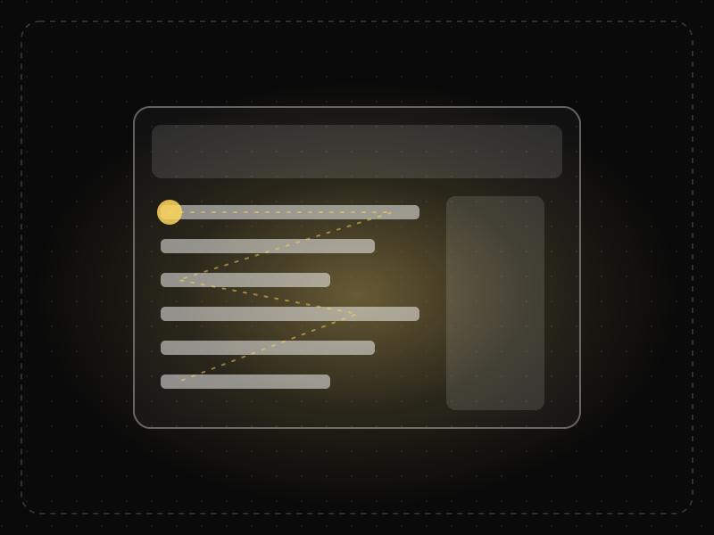
When pages lack clear structure, people scan text in an F-shape: across the top, across a little lower, then down the left side, missing much of the content.

See it in action
The same screen without and with F-Shaped Pattern. Watch both sides play out, then compare the outcome.
People scan the first lines, then slide down the left edge — the key detail on the right is never read.
Front-loaded headings and bullets put every key point where the scanning eye lands.
What to watch: the fixations trace an F on the left; on the right they hit every heading.
Front-load headings and paragraphs with the words that matter; use bullets and bold sparingly.
Hide important information mid-paragraph or on the right side of long lines.
Key takeaways
- Put the most important words at the start of headings, paragraphs and list items.
- Use headings, bullets and bold text to break the F-pattern into efficient scanning.
- Do not assume users read every word.
Quick facts
- Also known as
- F-pattern reading, F-shaped scanning
- Described by
- Jakob Nielsen (Nielsen Norman Group)
- Year
- 2006
- Category
- Memory & attention
- Related laws
- Selective Attention, Serial Position Effect, Banner Blindness
F-Shaped Pattern explained
In the F-pattern, readers first read a horizontal line across the top of the content, then a shorter horizontal line lower down, then scan vertically down the left side. The result looks like an F in heatmaps.
The pattern emerges when users are trying to be efficient and the page lacks clear cues about where important information is. They read the beginnings of lines and skip the rest.
The fix is not to place content in an F-shape, but to structure content so that users can scan purposefully: clear headings, front-loaded sentences, short paragraphs and lists.
Where it comes from
Jakob Nielsen and the Nielsen Norman Group identified the F-shaped pattern in eye-tracking studies published in 2006 and confirmed it in later research in 2017. They noted it is a symptom of poorly formatted content rather than a goal.
How it shows up in apps
Long help articles, terms, product descriptions and dense settings pages are scanned in an F-pattern, so content on the right and lower down is often missed. Well-structured content lets users scan more efficiently.
F-Shaped Pattern examples
A help article about refunds puts the key steps in the fourth paragraph. Eye-tracking shows readers skim the first lines and miss the steps. Rewriting with a summary, headings and a numbered list puts the answer where readers look.
Front-loaded headings
Headings such as 'Refunds: how to request one in 3 steps' put key words first, so users scanning the left side find what they need.
Bullet lists
Breaking features into bullets with bold first words lets users scan the list quickly.
Search results
Search result pages put the title and key information on the left, where scanning users look most.
How to apply F-Shaped Pattern
- Put the most important information first: summary before detail.
- Use descriptive headings and subheadings.
- Start paragraphs and list items with information-carrying words.
- Use bullets, numbered lists and bold sparingly to aid scanning.
- Keep paragraphs short.
Want F-Shaped Pattern checked in your own product? Our saas ux audit evaluates it alongside the other principles that shape how users decide, onboard and stay.
Common mistakes
- Burying key information in the middle of long paragraphs.
- Generic headings like 'Overview' that do not help scanning.
- Trying to design layouts in an F-shape instead of improving content structure.
How to measure it
Eye-tracking and scroll maps show how users scan pages. Measure findability of key information in usability tests and track help-centre search and contact rates after restructuring content.
Frequently asked questions
What is F-Shaped Pattern?
When pages lack clear structure, people scan text in an F-shape: across the top, across a little lower, then down the left side, missing much of the content.
Where does F-Shaped Pattern come from?
Jakob Nielsen and the Nielsen Norman Group identified the F-shaped pattern in eye-tracking studies published in 2006 and confirmed it in later research in 2017. They noted it is a symptom of poorly formatted content rather than a goal.
How does F-Shaped Pattern apply to app design?
Long help articles, terms, product descriptions and dense settings pages are scanned in an F-pattern, so content on the right and lower down is often missed. Well-structured content lets users scan more efficiently.
Is the F-pattern good or bad?
It is usually a sign that content is not well structured. Users fall into it when they cannot easily find what they need, so the goal is to help them scan more effectively.
What other scanning patterns exist?
Nielsen Norman Group also describes layer-cake, spotted, marking and commitment patterns, depending on content and user goals.
How do you measure F-Shaped Pattern in a product?
Eye-tracking and scroll maps show how users scan pages. Measure findability of key information in usability tests and track help-centre search and contact rates after restructuring content.
Sources
- Nielsen, J. (2006). F-Shaped Pattern For Reading Web Content. Nielsen Norman Group. Find on Google Scholar ↗
- Pernice, K. (2017). F-Shaped Pattern of Reading on the Web: Misunderstood, But Still Relevant. Nielsen Norman Group. Find on Google Scholar ↗
Related laws
 Memory & attention
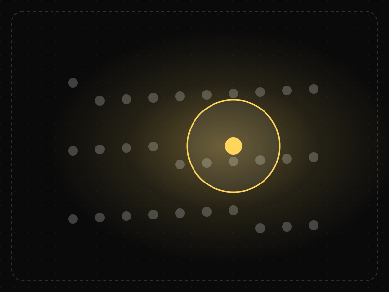
Selective Attention
People focus on the small part of their environment related to their current goal and filter out the rest — including things designers want them to notice.
 Memory & attention
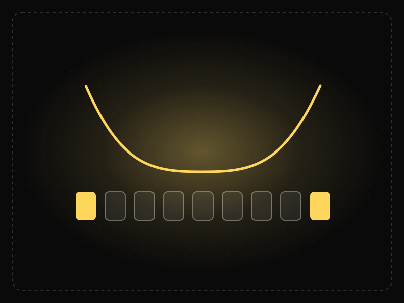
Serial Position Effect
People best remember the first and last items in a series and tend to forget the ones in the middle.
 Memory & attention
Banner Blindness
Users learn to ignore anything that looks like an advertisement, including real content that happens to be styled or placed like an ad.
F-Shaped Pattern in practice
- Career guidesUX psychology skills employers want in 2027: attention, memory, perception, decision-making and how designers apply them without manipulationUX psychology skills employers want in 2027: attention, memory, perception, decision-making, Hick's and Fitts's laws, cognitive load and ethics.
- Career guidesOn-page SEO skills employers want in 2027: intent-matched content, titles, headings, internal links and pages people and AI can quoteOn-page SEO skills employers want in 2027: search intent, titles and headings, answer-first structure, internal links, images and helpful content.
- Everyday design scienceWhy the human body is shaped the way it is: the design logic behind every partWhy is every body part shaped the way it is? Domes protect, tubes carry, folds add surface, levers move. The design logic of 164 parts, and which can be moved.
- Career guidesUX writing for multilingual products in 2027: writing for translation, microcopy patterns, tone across cultures, inclusive and accessible language, and how global product teams hire UX writersUX writing for multilingual products in 2027: writing for translation, microcopy, tone across cultures, inclusive and accessible language, and hiring.
- UI/UX designUX portfolio examples: 30 patterns that make hiring managers keep readingUX portfolio examples broken into 30 patterns — homepage, case study structure, visuals, writing and proof — that make hiring managers keep reading.
- Career guidesKnowledge base and support documentation skills for 2027: writing help articles people can scan, KCS, search-friendly titles, article upkeep, deflection metrics and AI-ready contentKnowledge base skills for 2027: scannable help articles, KCS, search-friendly titles, upkeep, self-service metrics, AI-ready content and pay.





Certifications that test it
- Free certification · UX/UI, Design, Research & CreativeUI Design CertificationCertifies that you can design clear, consistent, accessible interfaces — visual hierarchy, typography, colour, layout, components and interaction states.
- Free certification · UX/UI, Design, Research & CreativeUX Writing & Content Design CertificationCertifies that you can write interface copy that helps people act — microcopy, errors, onboarding, voice and tone, content structure and testing words.
- Free certification · Digital Marketing, SEO, AEO & GrowthApp Store Optimization (ASO) CertificationCertifies that you can grow app installs organically — keyword research and metadata, store creative, ratings and reviews, and store experiments, localisation and in-app events on the App Store and Google Play.



Get the ideas, not the noise.
Sign up with Google and we’ll send you short UX psychology tips by email — why people tap, stall and leave, and what to do about it. Unsubscribe anytime. Prefer something to keep? Get the free Laws of UX guide as a PDF.