 By
Quick answer: How do I audit my onboarding?
- Measure first: time and steps from sign-up to first value.
- Sign-up: only what's needed; social or passwordless if expected.
- First screen: never empty; templates or sample data.
- Progress: a short visible checklist toward the first result.
- Upgrade: only after the user has reached value.
Key takeaways
- Define the first meaningful result before you audit anything.
- Every extra step and choice costs some users.
- Defaults do most users' setup for them.
- Tours are not onboarding; doing the task is.
- Re-run the audit after every onboarding change.
Sign up for your own product with a new email address, on your phone, on mobile data, and time how long it takes to do the one thing your product is for. Most founders have never done this since the week they built it. In a SaaS product, especially a product-led one, onboarding is where most new users are won or lost: every later stage depends on getting through it. This audit gives you 20 checks across five stages, each tied to a principle from our Laws of UX library, plus a way to rate and fix what you find. Jump to how to run it, the 20 checks or severity.
- Checks in this audit
- 20
- Stages from sign-up to first value
- 5
- Result to define before you start
- 1
- Severity levels for ranking fixes
- 4
How to run a UX audit for SaaS onboarding

- Define the first meaningful result — the first invoice sent, report shared or teammate invited.
- Use a fresh account — new email, private window, desktop and a mid-range phone.
- Time it and count — minutes, screens, form fields and choices to the result.
- Record the session — screen-record yourself; install Microsoft Clarity for real users.
- Note evidence for each failure — a screenshot and the check it failed.
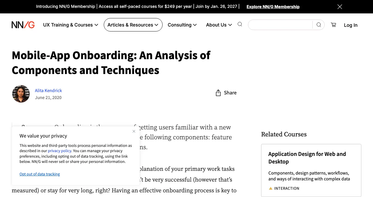
NN/g defines onboarding as getting users familiar with a new interface through dedicated flows, including any necessary setup, and notes it isn't only for first-time users. Audit the setup steps as carefully as the tips.
1. Sign-up: checks 1–4

- 1. Only essential fields — email and password, or a social/passwordless option users expect
- 2. No card before value — unless your trial model truly requires it, and then say why
- 3. Clear errors, inline — password rules shown before failure (H5, H9)
- 4. Verification doesn't block value — let users start while the email confirms
2. First screen: checks 5–8

- 5. One personalising question — role or goal, used to pick the first screen
- 6. No empty state — templates, sample data or an example project
- 7. One obvious next action — few choices per screen (Hick's Law)
- 8. Smart defaults — sensible settings pre-chosen (default effect)
3. Progress to first value: checks 9–12

- 9. A visible checklist — three to five steps toward the first result (goal-gradient effect)
- 10. Show some progress already made — "Account created" ticked first
- 11. Unfinished steps stay visible — a gentle reminder to return (Zeigarnik effect)
- 12. Advanced options later — hide what isn't needed yet (progressive disclosure)
4. Help and recovery: checks 13–16
- 13. Tours are short and skippable — or replaced by tips in context
- 14. Help where the confusion is — not only in a help centre
- 15. Users can go back without losing work — (H3)
- 16. A human is reachable — chat or email, visible during setup
5. Nudges and upgrade: checks 17–20
- 17. A useful nudge if they stall — one email pointing to the next step, not a sales sequence
- 18. Celebrate the first result — a clear moment that says it worked (peak-end rule)
- 19. Upgrade prompts appear after value — not before the first result
- 20. Limits and pricing are clear — what's free, what isn't, before users hit a wall
Rate severity and fix in order
| Severity | Meaning | Example | Fix |
|---|---|---|---|
| 4 Critical | Users can't reach the first result | Verification link fails on mobile | Now |
| 3 Major | Many users drop off or struggle | Empty first screen | This sprint |
| 2 Minor | Slows users down | An unskippable tour | Soon |
| 1 Cosmetic | Annoys but doesn't block | Inconsistent button labels | When convenient |
Table: Severity scale for onboarding audit findings (editorial scale, adapted from common usability practice)
After the audit

- Fix critical and major findings first
- Re-measure — time and steps to the first result
- Watch ten real sign-ups — in session recordings, to confirm
- Track activation weekly — the share of sign-ups reaching the first result
- Repeat monthly — onboarding drifts as features are added
Mistakes
- Auditing as yourself — you know where everything is
- Testing on desktop only — many sign-ups start on a phone
- Adding a tour to fix confusing UI — fix the UI
- Asking for a card, a phone number and a team size up front
- Measuring sign-ups instead of activation
Ready to audit?
How we built this audit
The onboarding definition comes from NN/g's onboarding analysis, the H-numbers from Nielsen's 10 usability heuristics, and each linked principle from our Laws of UX library; read on 17 November 2026. The 20 checks, the stages and the severity scale are our editorial template.
Key terms, defined
- Onboarding: the flows and setup that get new users productive.
- Activation: a new user reaching the first meaningful result.
- Empty state: a screen with no data yet.
- Goal-gradient effect: people speed up as they get closer to a goal.
- Progressive disclosure: showing advanced options only when needed.
Frequently asked questions
How do I audit my onboarding?
Define the first meaningful result, then go from sign-up to that result as a brand-new user on desktop and mobile. Time it, count steps and choices, and run each of the 20 checks. Record evidence, rate severity and fix blockers first. Then watch real users' recordings to confirm.
What is a UX audit for SaaS?
An evidence-based review of a SaaS product's usability, usually across sign-up, onboarding, core tasks, billing and retention. Onboarding is the highest-leverage part because every later stage depends on users getting through it.
What is a good SaaS onboarding flow?
One that gets a new user to a real result in as few steps as possible: a short sign-up, one personalising question, a pre-filled starting point, a visible checklist and help in context. It feels like using the product, not reading about it.
How do I measure onboarding success?
Activation rate (sign-ups who reach the first meaningful result), time to first value, drop-off at each step and 30-day retention of activated users.
Should onboarding include a product tour?
Only a short, skippable one, if any. Teaching in context (a tip when the user reaches a feature) usually works better than a tour before they've done anything.
Which Laws of UX apply to onboarding?
Hick's Law (fewer choices, faster decisions), the goal-gradient effect (people speed up as they near a goal), the Zeigarnik effect (unfinished tasks stay on our minds), the default effect (people keep defaults) and progressive disclosure (show advanced options later).
Sources
- Nielsen Norman Group — Mobile-App Onboarding: An Analysis of Components and Techniques (2020; checked 17 Nov 2026)
- Nielsen Norman Group — 10 Usability Heuristics for User Interface Design
- ProductLed — Product-Led Growth (PLG): What it means
- Microsoft Clarity (checked 17 Nov 2026)
- Checked November 17, 2026. Figures that change — fees, salaries, prices — are reviewed every six months; if something is out of date, tell us.
Where to go from here
- Laws of UX — the principles behind each check
- Product-led growth — why onboarding matters
- UX audit checklist — the full product
- Science of Apps - LaunchpadProduct-led growth for early startups: what PLG is, when it fits, freemium vs free trial, the activation metrics that matter and an onboarding checklist you can use this weekProduct-led growth for early startups: what PLG is, when it fits, freemium vs free trial, the metrics that matter and how onboarding makes or breaks it.
- Science of Apps - LaunchpadRoast my landing page: 25 fixes founders hear in landing page roasts, each with the principle that explains itRoast my landing page, done properly: 25 landing page fixes for headlines, CTAs, pricing, trust and speed, each tied to a usability or behavioural principle.
- Science of Apps - LaunchpadA landing page review checklist for startups: 36 evidence-based checks for clarity, trust, speed, mobile and the call to action, with the research behind eachA landing page review checklist for startups: 36 checks for the first 10 seconds, trust, speed, mobile and the call to action, from NN/g and Google research.
- Science of Apps - LaunchpadHow to launch a SaaS product in 2027: from private beta to public launch to the first paying customersHow to launch a SaaS in 2027, step by step: private beta, pricing, onboarding that activates, a permanent page, launch days, and turning trials into customers.
- Science of Apps - LaunchpadA free website UX audit for startups: the five things to check first (findability, clarity, speed, accessibility, the sign-up path) with the free tools that measure eachA free website UX audit for startups: check findability, clarity, speed, accessibility and the sign-up path first, with free Google, WebAIM and Microsoft tools.
- Science of Apps - LaunchpadThe UX audit checklist: a free, journey-based template for websites and apps, built on Nielsen's heuristics and WCAG 2.2A free UX audit checklist for websites and apps: 60 checks across the user journey, from first impression to payment, using Nielsen's heuristics and WCAG 2.2.




Get the ideas, not the noise.
Sign up with Google and we’ll send you short UX psychology tips by email — why people tap, stall and leave, and what to do about it. Unsubscribe anytime. Prefer something to keep? Get the free Laws of UX guide as a PDF.
Launch day ends. Your listing shouldn't.
List free on the Launchpad and, once live, get a free report on your landing page, discoverability and speed; deeper reports test sign-up and onboarding behind the login, with evidence.