 By
Quick answer: What makes a good SaaS pricing page?
- Three or four plans, each named for who it's for.
- Price, billing period and key limits visible without clicking.
- One highlighted plan and one clear call to action per plan.
- Show the free tier or trial and what happens when it ends.
- An FAQ that answers the objections that stop people paying.
Key takeaways
- Clarity beats cleverness: visitors should pick a plan in under a minute.
- Anchoring, decoys and defaults work, but only honestly.
- Hide nothing that will surprise people at checkout.
- The yearly toggle should show the saving, not hide it.
- Test the page on a phone; tables break first.
Your SaaS pricing page is where interest turns into a decision. Visitors who reach it are close to buying, which makes every unclear plan name, hidden limit and confusing toggle expensive. Good pricing page design isn't about clever tricks. It's about letting the right customer find the right plan quickly and trust what they'll pay. This guide covers 12 SaaS pricing page best practices, four real pricing page examples (Linear, Slack, Maze and Tally) and the psychology behind them, plus how to test your own page. Every example was checked on its own page on 18 November 2026. Jump to the 12 rules, the examples or a free check.
What makes a good SaaS pricing page? The 12 rules
| # | Pricing page best practice | Why it works |
|---|---|---|
| 1 | Three or four plans | Fewer options make the choice faster (choice overload) |
| 2 | Name plans for who they're for | Visitors self-select in seconds |
| 3 | Price, period and key limit visible | No clicking to find the basics |
| 4 | Highlight one recommended plan | A default reduces effort (default effect) |
| 5 | Monthly / yearly toggle that shows the saving | The discount is a reason to commit |
| 6 | Explain the free tier or trial | Visitors know the risk is low |
| 7 | One clear CTA per plan | Each button says what happens next |
| 8 | "All of the previous plan, plus" lists | Differences are easy to scan |
| 9 | Full comparison table lower down | Details for those who need them |
| 10 | Trust signals near the buttons | Logos, security and cancellation terms |
| 11 | A billing FAQ | Answers objections before they stop the sale |
| 12 | Works on a phone | Tables and toggles break first on narrow screens |
Table: 12 SaaS pricing page best practices (Science of Apps editorial checklist)
Pricing page examples: four real SaaS pricing pages
These pricing page examples were chosen because each shows several of the rules clearly. Prices are as displayed when captured (Linear and Slack on 18 November 2026, Maze and Tally on 17 November 2026) and may change.
1. Linear: four plans, one line of difference
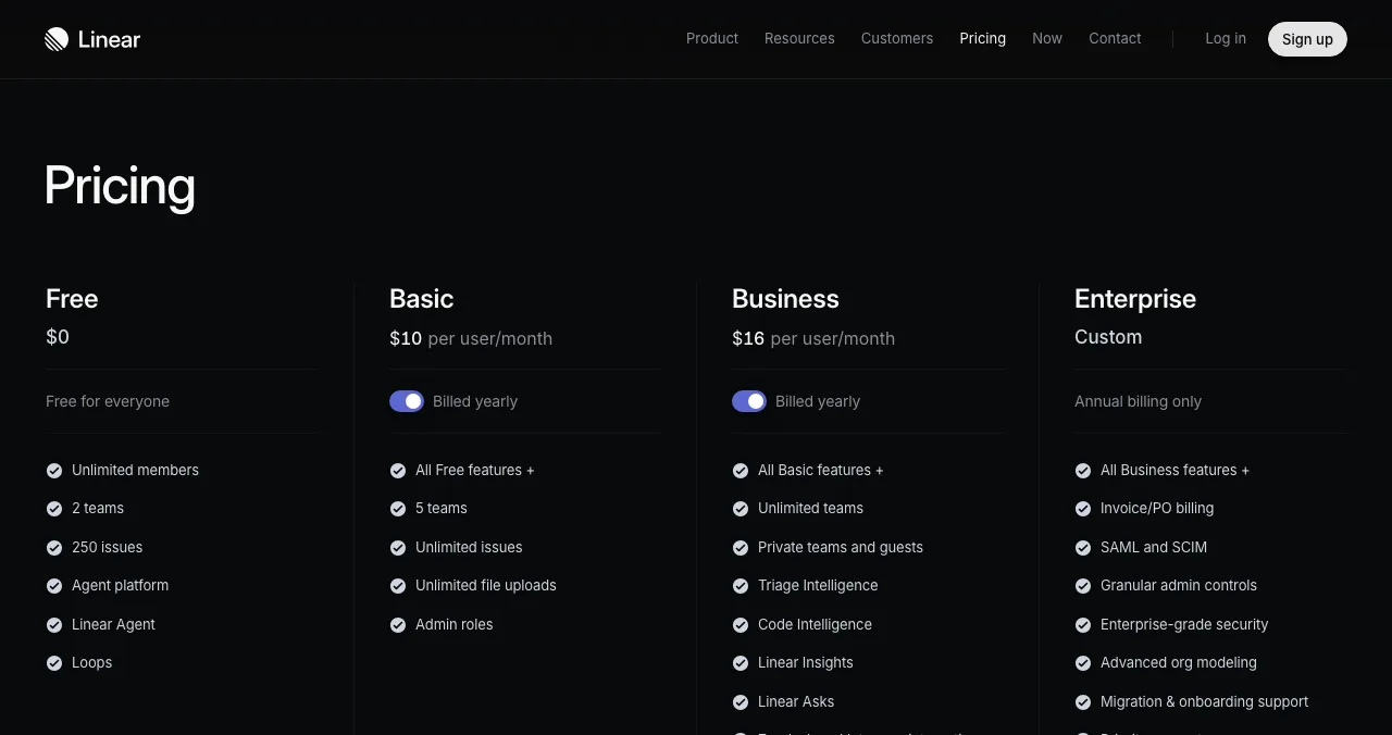
Linear's pricing page shows four plans in one row: Free ($0), Basic ($10 per user/month), Business ($16 per user/month) and Enterprise (Custom), with the paid tiers marked "Billed yearly". Each feature list starts with "All Free features +" or "All Basic features +", so visitors read only what changes.
- Rules shown: 1, 3, 5, 8.
- Worth copying: the "everything in the last plan, plus" pattern.
2. Slack: free first, anchored prices, logos above the fold
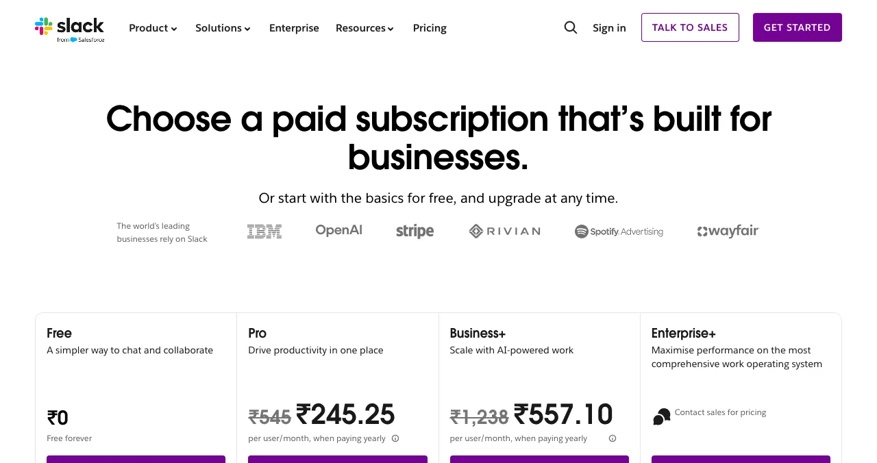
Slack opens with "Or start with the basics for free, and upgrade at any time", then a row of customer logos before any price. Its four plans (Free, Pro, Business+, Enterprise+) show the original price struck through beside the current one, with "when paying yearly" underneath. Our capture showed regional prices; Enterprise+ says "Contact sales for pricing".
- Rules shown: 1, 5, 6, 10.
- Psychology: the struck-through price is anchoring; it's honest only if the original price is real.
3. Maze: the free plan's limits up front
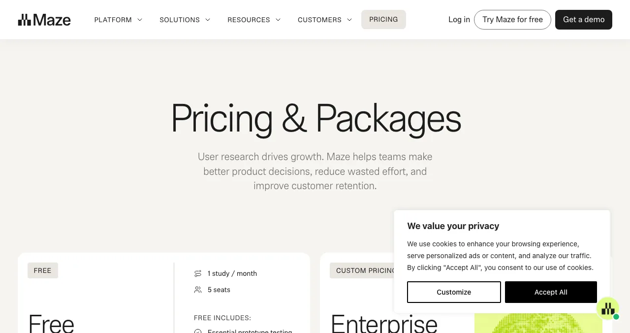
When we captured it on 17 November 2026, Maze's pricing page stated its Free plan's limits in the plan card itself: one study per month and five seats. Visitors know exactly what free means before they sign up, which avoids the surprise that makes people distrust a product.
- Rules shown: 3, 6.
4. Tally: lead with what's free
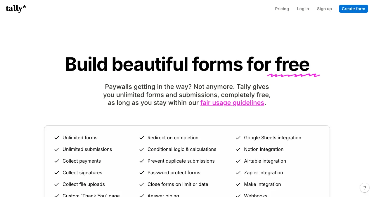
Tally's pricing page leads with "Build beautiful forms for free" and a list of what the free plan includes. For a product that grows through a generous free tier, the pricing page's first job is to remove doubt about free.
- Rules shown: 2, 6.
| Example | Plans shown | Free option | Standout pattern |
|---|---|---|---|
| Linear | 4 | Free plan | "All previous features +" lists |
| Slack | 4 | Free plan | Logos above the plans; struck-through prices |
| Maze | Free and paid | Free plan with stated limits | Limits in the card |
| Tally | Free and paid | Free plan as the headline | Leads with free |
Table: Four SaaS pricing page examples compared (checked 18 Nov 2026)
The psychology of pricing page design
Four principles explain most of what works on a pricing page. Use them honestly.

Anchoring
The first number people see sets their sense of value. Showing an enterprise tier or an original price makes the middle plan feel reasonable. Anchoring effect.
Decoy
A plan that's clearly worse value than its neighbour makes the neighbour look better. Decoy effect.
Choice overload
Too many similar plans slow the decision or stop it. Choice overload.
Defaults
A highlighted "Most popular" plan is the one most people choose. Default effect.
The pricing page in a product audit

The Science of Apps Launchpad is a free, permanent listing for SaaS and other products, ranked by relevance, editorial picks and community interest, never payment. Its product investigation tests the product end to end. "Pricing and plans" is one of its 22 areas, with two automatic pricing-page measurements among its 39, and the Pay stage reviews the paywall, upgrade, checkout and payments. The investigation page's own example finding is a plan toggle that "defaults to monthly and hides the yearly saving" (rule 5).
Arrive
Pricing and plans
Plans, prices, toggles and limits, measured automatically.
Pay
Paywall and upgrade
When and how the product asks for money.
Pay
Checkout and payments
Forms, trust and errors at the moment of payment.
From pricing page to paid customer
List free, then order the report that fits your stage.

 Economy
See what new customers see
- Store listing and homepage, screen by screen
- Scorecard against 60 Laws of UX
- The fixes worth most
PremiumThe full diagnosis and the plan
- Every screen, every finding, every flow
- All 60 laws with evidence and fixes
- 8 strategy chapters and a 90-day roadmap
Fact-checked against the evidence. Private by default.
How to fix your pricing page in a week

- Measure the drop. In analytics, compare pricing-page visits with sign-up starts.
- Five-user test. Ask five target users to pick a plan and explain why.
- Rename plans for who they're for, and cut to three or four.
- Put the basics up top: price, period and the one limit that matters.
- Fix the toggle so the yearly saving is visible.
- Add a billing FAQ: trials, cancellation, refunds, taxes.
- Check it on a phone and fix any table that scrolls sideways.
Pricing page mistakes

- "Contact us" for every plan — small customers leave
- Plans named Basic, Pro, Premium — say who each one is for
- Hidden limits — surprises at checkout cost trust
- A toggle that hides the saving — show both prices
- Too many tiers — choice overload slows the decision
- A desktop-only table — test on a 375 px screen
- Fake urgency or fake original prices — dishonest anchoring backfires
Ready to check your pricing?
How we chose the examples
We picked four public SaaS pricing pages that each show several rules clearly and that loaded in a standard browser on 18 November 2026; we have no relationship with any of them. Prices are as displayed that day, in the region our browser was in. The 12 rules are Science of Apps' editorial checklist; the psychology links go to our Laws of UX pages. Investigation facts come from launchpad.scienceofapps.com/investigate. Science of Apps runs the Launchpad.
Key terms, defined
- SaaS pricing page: the page that sets out a software product's plans, prices and limits.
- Anchoring: the first number people see shapes how they judge the next ones.
- Decoy pricing: a plan designed to make a neighbouring plan look like better value.
- Choice overload: too many similar options make a decision slower or stop it.
- Billing toggle: a switch between monthly and yearly prices.
- Dark pattern: a design that tricks users into choices they didn't intend.
Frequently asked questions
What makes a good SaaS pricing page?
Clarity. Three or four plans, each named for a type of customer, with the price, billing period and main limits visible at a glance. One plan is highlighted as recommended, the free tier or trial is explained, a comparison table holds the details, an FAQ answers objections, and every plan has one clear call to action. It should work on a phone.
How many plans should a SaaS pricing page have?
Most SaaS pricing pages show three or four, often a free or starter plan, one or two paid tiers and an enterprise option. Fewer choices make the decision faster; choice overload sets in when visitors must compare many similar options. Linear, Slack and others shown in this guide use four columns, with the last one for sales-led enterprise deals.
Should I show prices on my pricing page?
Yes, for self-serve plans. Hiding prices behind 'Contact us' makes small customers leave and suggests the price is high. It's normal to show 'Custom' or 'Contact sales' for an enterprise tier only, as many SaaS companies do, while keeping self-serve prices visible.
What are good pricing page design best practices?
Put plan names, prices and the main difference between plans in the first screen. Highlight one plan. Use a monthly and yearly toggle that shows the saving. Keep the full feature comparison lower down. Add trust signals near the buttons, an FAQ about billing and cancellation, and make sure the table works on a narrow phone screen.
Is it ethical to use anchoring and decoy pricing?
It can be, if every option is real and fairly described. Anchoring shows a higher price first so others feel reasonable; a decoy is a plan designed to make another look better. Both become dark patterns when they mislead, such as a fake 'original' price or a plan nobody can buy. Keep every price and comparison honest.
How do I test my SaaS pricing page?
Watch five target users choose a plan and ask them to explain their choice. Check whether visitors who reach the pricing page start sign-up, using your analytics funnel. Test it on a phone. A structured audit adds automatic measurements of the pricing page and an expert review of plans, the paywall and checkout.
Sources
- Linear — Pricing (checked 18 Nov 2026)
- Slack — Pricing (checked 18 Nov 2026)
- Maze — Pricing (checked 18 Nov 2026)
- Tally — Pricing (checked 18 Nov 2026)
- Science of Apps — Product investigation: pricing and plans area (checked 18 Nov 2026)
- Science of Apps — Laws of UX: anchoring effect
- Science of Apps — Laws of UX: choice overload
- Checked November 18, 2026. Figures that change — fees, salaries, prices — are reviewed every six months; if something is out of date, tell us.
Where to go from here
- Paywall audit — the in-app side of pricing
- Landing page conversion checklist — the page before pricing
- Traffic but no sign-ups — 15 causes and fixes
- Science of Apps - LaunchpadA landing page review checklist for startups: 36 evidence-based checks for clarity, trust, speed, mobile and the call to action, with the research behind eachA landing page review checklist for startups: 36 checks for the first 10 seconds, trust, speed, mobile and the call to action, from NN/g and Google research.
- Science of Apps - LaunchpadRoast my landing page: 25 fixes founders hear in landing page roasts, each with the principle that explains itRoast my landing page, done properly: 25 landing page fixes for headlines, CTAs, pricing, trust and speed, each tied to a usability or behavioural principle.
- Science of Apps - LaunchpadA paywall audit for subscription apps: 18 checks for clarity, choice, trust and timing, the app-store rules your paywall must follow, and patterns from good paywall examplesA paywall audit for subscription apps: 18 checks for clarity, plan choice, trust and timing, plus the Apple and Google Play rules to follow.
- Science of Apps - LaunchpadWebsite traffic but no conversions: 15 causes of visitors but no sign-ups, how to tell which one is yours, and the fix for eachWebsite traffic but no conversions? 15 causes of visitors but no sign-ups, from the wrong audience to slow pages, with a diagnosis for each and a free check.
- Science of Apps - LaunchpadThe best UX audit tools for startups, free and paid: what each one actually checks (behaviour, speed, accessibility, research) and the gaps no tool fillsThe best UX audit tools for startups, free and paid: Clarity, PageSpeed Insights, WAVE, Hotjar, Maze and an end-to-end product test, with what each checks.
- UI/UX designDark patterns examples: 15 tricks apps use on you — and India's rules against them15 dark pattern examples — false urgency, basket sneaking, drip pricing, subscription traps — the psychology behind them and India's 2023 rules.




Get the ideas, not the noise.
Sign up with Google and we’ll send you short UX psychology tips by email — why people tap, stall and leave, and what to do about it. Unsubscribe anytime. Prefer something to keep? Get the free Laws of UX guide as a PDF.
Launch day ends. Your listing shouldn't.
List free on the Science of Apps Launchpad: the product investigation measures your pricing page automatically and reviews plans, the paywall and checkout as part of a full end-to-end report.