Law of Prägnanz
Also known as Law of Simplicity, Law of Good Figure
People interpret complex or ambiguous visuals in the simplest way possible, because simple forms take the least mental effort to process.
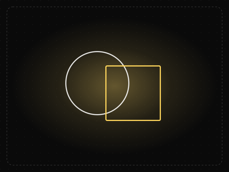
See it in action
The same screen without and with Law of Prägnanz. Watch both sides play out, then compare the outcome.
Every extra stroke has to be parsed before the shape resolves — the icon reads slowly, especially at 24px.
One simple outline is recognised almost instantly and stays legible at small sizes.
What to watch: the recognition bar: the simple form resolves long before the detailed one.
Reduce icons, charts and layouts to the simplest shapes that still carry the meaning.
Add realistic detail, overlapping shapes or decoration that the eye must untangle.
Key takeaways
- Simple, recognizable shapes and layouts are processed faster.
- Icons and illustrations should resolve into one clear meaning.
- Visual complexity forces users to work out what they're looking at.
Quick facts
- Also known as
- Law of Simplicity, Law of Good Figure
- Described by
- Gestalt psychologists (Wertheimer, Koffka, Köhler)
- Year
- 1920s
- Category
- Perception
- Related laws
- Aesthetic-Usability Effect, Occam's Razor, Cognitive Load, Law of Closure
Law of Prägnanz explained
The Law of Prägnanz, also called the law of simplicity or good figure, states that people perceive and interpret ambiguous or complex images in the simplest form possible. The brain prefers explanations that require the least cognitive effort.
When shown overlapping shapes, people see a few simple shapes rather than one complex outline. When shown a busy interface, they look for the simplest structure that explains it, and they struggle when there is none.
For designers, this means simple, regular forms are easier to recognise and remember. Clear shapes, consistent alignment and uncomplicated icons help users understand an interface at a glance.
Where it comes from
A core Gestalt principle, from the German word for 'conciseness', described by Max Wertheimer and Kurt Koffka in the 1920s and 1930s.
How it shows up in apps
Icons, onboarding illustrations and data visualizations are read at a glance. When they can be interpreted several ways, users either misread them or slow down.
Law of Prägnanz examples
Replacing a detailed, multi-colored settings icon with a simple gear outline makes it recognizable at small sizes and in a busy toolbar.
Simple logos and icons
Many memorable brand marks and app icons are built from basic geometric forms, which makes them easy to recognise at small sizes and remember after a glance.
Clean grid layouts
Pages aligned to a consistent grid are perceived as orderly and easy to scan, while elements placed off-grid make the page feel cluttered even with the same content.
Data visualisation
A simple bar chart is understood faster than a 3D pie chart with many slices, because the brain can read the simpler form directly.
How to apply Law of Prägnanz
- Use simple, recognisable shapes for icons, buttons and illustrations.
- Align elements to a consistent grid so layouts read as orderly.
- Reduce visual noise: limit fonts, colours and decorative effects.
- Simplify charts and diagrams to the minimum needed to communicate the point.
- Test icons without labels to check whether their simplest reading matches their meaning.
Want Law of Prägnanz checked in your own product? Our mobile app ux audit evaluates it alongside the other principles that shape how users decide, onboard and stay.
Common mistakes
- Adding detail to icons and illustrations that makes them harder to read at small sizes.
- Combining many visual styles, which prevents the eye from finding a simple structure.
- Confusing simplicity with emptiness; removing necessary information does not make an interface easier.
How to measure it
Five-second tests and first-impression surveys show whether people grasp a layout's structure quickly. Icon recognition tests measure whether symbols are understood without labels.
Frequently asked questions
What is Law of Prägnanz?
People interpret complex or ambiguous visuals in the simplest way possible, because simple forms take the least mental effort to process.
Where does Law of Prägnanz come from?
A core Gestalt principle, from the German word for 'conciseness', described by Max Wertheimer and Kurt Koffka in the 1920s and 1930s.
How does Law of Prägnanz apply to app design?
Icons, onboarding illustrations and data visualizations are read at a glance. When they can be interpreted several ways, users either misread them or slow down.
What does Prägnanz mean?
Prägnanz is a German word roughly meaning 'conciseness' or 'pithiness'. In Gestalt psychology it describes the tendency to perceive things in their simplest form.
How does the Law of Prägnanz apply to UX?
Users interpret interfaces in the simplest way possible, so designs built from clear shapes, consistent alignment and minimal noise are understood faster and remembered better.
How do you measure Law of Prägnanz in a product?
Five-second tests and first-impression surveys show whether people grasp a layout's structure quickly. Icon recognition tests measure whether symbols are understood without labels.
Sources
- Koffka, K. (1935). Principles of Gestalt Psychology. Harcourt, Brace. Find on Google Scholar ↗
- Wertheimer, M. (1923). Untersuchungen zur Lehre von der Gestalt II. Psychologische Forschung, 4. Find on Google Scholar ↗
Related laws
 Perception
Aesthetic-Usability Effect
People perceive attractive interfaces as easier to use — and are more forgiving of their flaws — than plain ones with the same functionality.
 Product strategy
Occam's Razor
Among solutions that work equally well, prefer the one with the fewest assumptions and parts — in design, the simplest option that does the job.
 Memory & attention
Cognitive Load
Cognitive load is the amount of mental effort needed to understand and use an interface; when it exceeds what people can handle, they slow down, make mistakes or give up.
 Perception
Law of Closure
People mentally complete incomplete shapes and patterns, perceiving a whole even when parts of it are missing.
Law of Prägnanz in practice
- Everyday design scienceLondon Tube map history: why Harry Beck's 1933 diagram isn't to scale, and why that worksLondon Tube map history from the 1908 geographic maps to Harry Beck's 1933 diagram. Why it isn't to scale, how it shapes route choices and what research shows.
- Design historyLogo evolution: how 20 famous logos changed, and why almost all of them got simplerLogo evolution of 20 brands from Coca-Cola (1886) to Air India (2023): who designed each, what changed, and the memory science behind simpler logos.
- App developmentHow long does it take to build an app? Real timelines, not agency promisesA simple app takes 6–10 weeks, most first versions 3–6 months, complex fintech or marketplace apps 6–12 months. Phase-by-phase timelines and what really slips.
- Career guidesUX psychology skills employers want in 2027: attention, memory, perception, decision-making and how designers apply them without manipulationUX psychology skills employers want in 2027: attention, memory, perception, decision-making, Hick's and Fitts's laws, cognitive load and ethics.
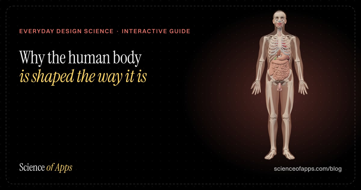
- Everyday design scienceWhy the human body is shaped the way it is: the design logic behind every partWhy is every body part shaped the way it is? Domes protect, tubes carry, folds add surface, levers move. The design logic of 164 parts, and which can be moved.
- UI/UX designApp accessibility checklist: WCAG made simple for mobile and web appsA practical app accessibility checklist based on WCAG 2.2: contrast, text size, touch targets, screen readers, motion and forms, plus India's GIGW 3.0.

Certifications that test it

Get the ideas, not the noise.
Sign up with Google and we’ll send you short UX psychology tips by email — why people tap, stall and leave, and what to do about it. Unsubscribe anytime. Prefer something to keep? Get the free Laws of UX guide as a PDF.