Law of Closure
Also known as Gestalt principle of closure
People mentally complete incomplete shapes and patterns, perceiving a whole even when parts of it are missing.
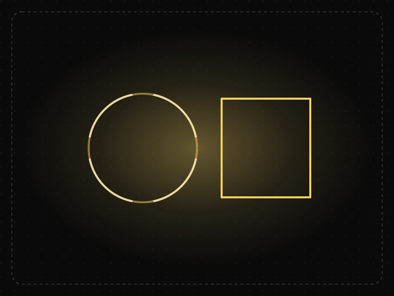
See it in action
The same screen without and with Law of Closure. Watch both sides play out, then compare the outcome.
Closed frames around closed shapes add visual noise without adding meaning.
Dashed rings and partial strokes are perceived as whole shapes — lighter, calmer, just as clear.
What to watch: the faint full circles that flash in: that's the completion your brain does automatically.
Use implied shapes — partial outlines, cut-off cards, progress rings — to reduce visual weight.
Leave gaps so large or irregular that the shape can no longer be completed.
Key takeaways
- Simple, partial shapes are enough for users to recognise icons and objects.
- Partly visible content at a screen edge signals that there is more to scroll or swipe to.
- Missing parts must still leave a clear, unambiguous whole.
Quick facts
- Also known as
- Gestalt principle of closure
- Described by
- Gestalt psychologists (Wertheimer, Koffka, Köhler)
- Year
- 1920s
- Category
- Perception
- Related laws
- Law of Prägnanz, Law of Continuity, Figure-Ground
Law of Closure explained
The Law of Closure states that when we see an incomplete shape, our brain fills in the gaps to perceive a complete figure. A circle with a small gap is still seen as a circle; a set of dots arranged in a ring is seen as a ring.
Closure happens because perception seeks meaningful, stable wholes. The brain prefers to complete a familiar pattern rather than treat each fragment separately.
In interfaces, closure enables minimal visual design and is a powerful cue for hidden content. But it only works when the intended whole is obvious; ambiguous fragments cause confusion.
Where it comes from
Closure is one of the Gestalt principles of perception developed by German psychologists including Max Wertheimer, Kurt Koffka and Wolfgang Köhler in the 1920s. They showed that the brain actively organises incomplete visual information into complete, meaningful forms.
How it shows up in apps
Closure lets designers use minimal icons, outlined shapes and cropped content. A carousel that cuts off the last card at the screen edge tells users the row continues, while icons built from a few strokes are still read as complete objects.
Law of Closure examples
A horizontally scrolling row of cards shows two full cards and part of a third. Users perceive the incomplete card as continuing beyond the edge and swipe to see more, without needing an arrow or 'scroll' label.
Cropped carousels
Showing a partial card at the edge of a horizontal list signals more content beyond the screen, which increases swiping compared with lists that end exactly at the edge.
Minimal icons
Line icons for search, home or settings use only a few strokes, yet users perceive complete objects because closure fills in the rest.
Progress rings
An incomplete progress ring reads as part of a full circle, so users instantly understand how much remains.
How to apply Law of Closure
- Use partial content at edges to hint at scrollable areas.
- Design icons with the minimum strokes needed for recognition.
- Test simplified shapes to make sure users complete them correctly.
- Use closure in progress indicators to show what remains.
- Avoid ambiguous fragments that could be completed in multiple ways.
Want Law of Closure checked in your own product? Our mobile app ux audit evaluates it alongside the other principles that shape how users decide, onboard and stay.
Common mistakes
- Cropping content so precisely at the edge that users think there is nothing more.
- Oversimplifying icons until they can be misread.
- Relying on closure for critical information that should be explicit.
How to measure it
Measure scroll and swipe rates on carousels with and without partial items, and run icon recognition tests to check that simplified shapes are completed correctly.
Frequently asked questions
What is Law of Closure?
People mentally complete incomplete shapes and patterns, perceiving a whole even when parts of it are missing.
Where does Law of Closure come from?
Closure is one of the Gestalt principles of perception developed by German psychologists including Max Wertheimer, Kurt Koffka and Wolfgang Köhler in the 1920s. They showed that the brain actively organises incomplete visual information into complete, meaningful forms.
How does Law of Closure apply to app design?
Closure lets designers use minimal icons, outlined shapes and cropped content. A carousel that cuts off the last card at the screen edge tells users the row continues, while icons built from a few strokes are still read as complete objects.
What is an example of the Law of Closure?
The WWF panda logo, or any icon drawn with gaps, where viewers still perceive a complete figure even though parts of the outline are missing.
How does closure help show more content?
Partially visible items at the edge of a screen are perceived as continuing, which signals that users can scroll or swipe to see more.
How do you measure Law of Closure in a product?
Measure scroll and swipe rates on carousels with and without partial items, and run icon recognition tests to check that simplified shapes are completed correctly.
Sources
- Wertheimer, M. (1923). Untersuchungen zur Lehre von der Gestalt II. Psychologische Forschung, 4. Find on Google Scholar ↗
- Koffka, K. (1935). Principles of Gestalt Psychology. Harcourt, Brace. Find on Google Scholar ↗
Related laws
 Perception
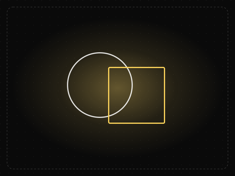
Law of Prägnanz
People interpret complex or ambiguous visuals in the simplest way possible, because simple forms take the least mental effort to process.
 Perception
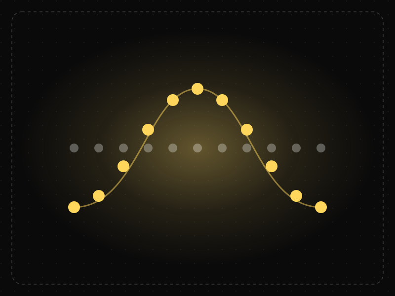
Law of Continuity
The eye follows smooth lines and curves, so elements arranged along a line or path are perceived as related and in sequence.
 Perception
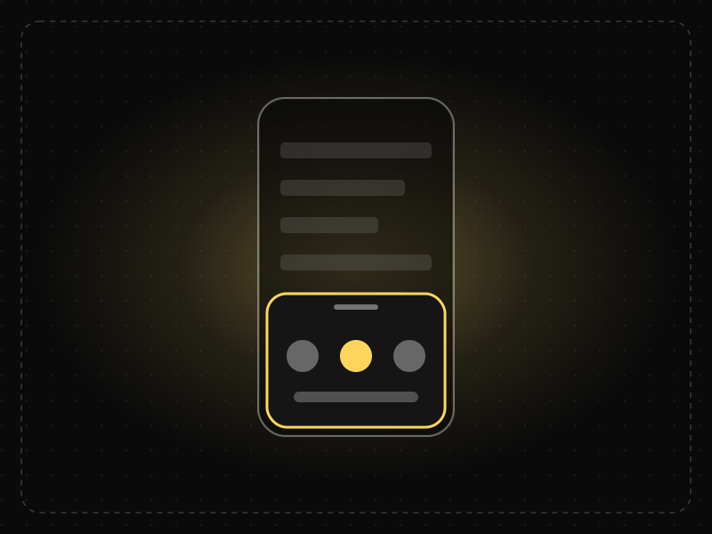
Figure-Ground
People instinctively separate what they see into a foreground object (the figure) and the background (the ground), and focus on the figure.
Law of Closure in practice
- Career guidesUX psychology skills employers want in 2027: attention, memory, perception, decision-making and how designers apply them without manipulationUX psychology skills employers want in 2027: attention, memory, perception, decision-making, Hick's and Fitts's laws, cognitive load and ethics.
- UI/UX designLaws of UX explained: Hick's law, Fitts's law and Jakob's law, with app examplesThe three most-used laws of UX explained with app examples: Hick's law (choices), Fitts's law (target size and distance) and Jakob's law (familiarity).
- Everyday design scienceWhy are stop signs octagons? The design rules behind road signs around the worldStop signs are octagons so drivers recognise them by shape alone, even from behind. The history of road sign shapes, colours and lettering from 1923 to today.
- Everyday design scienceWhy the human body is shaped the way it is: the design logic behind every partWhy is every body part shaped the way it is? Domes protect, tubes carry, folds add surface, levers move. The design logic of 164 parts, and which can be moved.
- Everyday design scienceLondon Tube map history: why Harry Beck's 1933 diagram isn't to scale, and why that worksLondon Tube map history from the 1908 geographic maps to Harry Beck's 1933 diagram. Why it isn't to scale, how it shapes route choices and what research shows.
- Career guidesOOP interview questions for developers in 2027: the principles, SOLID, patterns and design tasks interviews useOOP interview questions for developers in 2027: the four pillars, SOLID, composition, design patterns and low-level design, with answers.
Get the ideas, not the noise.
Sign up with Google and we’ll send you short UX psychology tips by email — why people tap, stall and leave, and what to do about it. Unsubscribe anytime. Prefer something to keep? Get the free Laws of UX guide as a PDF.